Your choice
This brief asked me to draw on all the skills, insight and experience that I had gained so far to design and produce a book of my choice. I was incredibly excited to begin this project – after identifying areas of interest, researching some exciting typography artists and browsing through my old journals, I was keen to draw inspiration from lots of places. I went through the brief, as I usually do, in my sketchbook and jotted down some ideas.


My project was already inspired by my research during Part 5 so far, while also growing from the starting point ‘Typography’.
Typography: Extend your exploration of typography by continuing to develop creative approaches to how typography, layout and your material choices can help generate meaning. Develop a book that explores one aspect of typography in more detail, or combines a variety of approaches. Just because your project explores typography, it doesn’t mean you can’t also include images, colour and narrative.
Research
During my Book Fairs research, I had discovered Delpha Hudson and her project ‘Theatre of the Self’. I was so intrigued that I ordered myself a copy and delved in. I wrote my reflections here. It was fascinating to read about the therapeutic benefits of her process and it inspired me to dig out my old journals (or ‘random books’ as I called them), where I used to jot down thoughts, feelings and some little poems too.


I also found Jean McEwan, an artist who creates zines using collage techniques. I ordered a few of her zines to explore. She creates surreal imagery on the pages which is really captivating. She also leaves spaces, to make sure the reader’s attention is directed to a particular area of the spread. Sometimes, her collages are a little busier, like my random book pages. I wrote some more reflections here.

Looking through Jean McEwan’s zines prompted me to explore collage a little further. I found a book called Project Collage by Bev Speight, which discusses collage as a technique, where it comes from and how it can be used. There are some project ideas, which was a brilliant source of inspiration for my final book. I particularly liked the surreal imagery created, using humans and other objects too. Using a mixture of eyes, mouths and noses from different images can create funny, intriguing and sometimes quite unnerving results. I also enjoyed looking at the hole-punching projects, which is an idea that had never occurred to me before.


During the exercises in Part 5, I have been identifying my particular areas of interest, which I narrowed down to visual poetry. I knew my final book was going to focus on this. I’d been using the exercises and research time leading up to my final assignment to look into visual poetry and all its branches – concrete poetry, shape poetry, pattern poetry, vispo – in more detail. My reflections on Sam Winston and The New Concrete have particularly informed and inspired this final assignment. I also enjoyed reading Victoria Bean’s ‘Caught’ – a book of her poems based on her year in Horseferry Road Magistrate’s Court. Although not particularly ‘visual’, her poetry captured such a spectrum of human emotion – some are quite comedic, while others are tragic and so impactful – which is what I hoped to show in my own poetry.


Another form of inspiration for my final book came from one of my favourite books (that I identified back in Part 1 Exercise 1 – Influential Books) – Jandy Nelson’s ‘The Sky is Everywhere’. Throughout this book, Jandy Nelson includes poems written on objects that help tell the story and reveal more about the characters. I adored this book during my teen years, and I think it did a lot to inform my own poetry jottings in my random books. The poems are quite visual and use found objects too, which made me think of them when generating ideas for this project.


To summarise, my inspirations for this project come from lots of places, and the links in this section provide more detail about my research for the book. My aim was to create a book that explored visual poetry, using my old diaries as inspiration. I did not burn my diaries after sifting through them (as Delpha Hudson did), but I did find it incredibly cathartic to read through my experiences and turn these words into something beautiful. Below are some photos of pages from my random books, to help put into context how I use a diary. They were like art journals in a way, but sometimes I’d only write words. I think this is why visual poetry as a concept resonates with me so much. You’ll also see lots of found objects stuck into the pages – another reason why I wanted to use collage in my book.


I also looked at other examples of poetry books for inspiration, which I will discuss later.
The brief asked me to consider these questions in the research stage:
What is the flow of the content?
I sifted through my diaries and picked out poems/sentences to use in my book. These went through several rounds of ‘narrowing down’ to ensure I was left with my favourites or the ones I could imagine as visual poems. I then had a few hours of playing with the order of the poems, to create a kind of narrative through the book. Most poetry books that I own have a general narrative – for example, Rupi Kaur’s books tend to be split into themes, such as ‘the hurting’, ‘the loving’, ‘the breaking’ and ‘the healing’ – so I wanted to achieve something similar.


I found that I was instinctively pairing poems together that felt complementary, then I put them all in an order. Usually, this was in the order of particular events in my life, or similar themes were grouped together (like break ups or falling in love). I used sticky notes so I could keep moving the poems around until I was happy.
Would you write/create imagery/both?
I knew from the start that I wanted to create all the imagery and words in my book. I took the words from my diaries and I created imagery from scratch, using a variety of materials (including collage, where I physically manipulated existing imagery to create new images).
What do you want to tell about the subject?
My subject – visual poetry – can be split into different styles or areas. I wanted to show a range of approaches to playing with words. I wanted to create shape poems, pattern poems and concrete poems too. I wanted to use a mixture of handwritten text and fonts on my DTP software. What I hoped more than anything was to create an experience for someone when reading the book – to feel like they were experiencing more than just words on a page.
How will you communicate this?
I knew that I needed to use a mixture of digital and analogue approaches for my book, to create the effect I had in my head. Also, my words from my diaries would be responsible for communicating the concept of ‘visual poetry’, so it was important to explore lots of options for how to present the words on the pages.
Who is your audience?
I identified my audience as people who enjoy poetry and people who enjoy art – this crossover would be ideal. I imagine that the subjects my poems cover are quite universal, but potentially young adults would be most likely to read them and relate to them. Anyone who enjoys reading about romance and heartbreak or enjoys inspirational writing might like the content too.
Flat plan
To help me with the structure and flow of the book, I mentioned that I looked at other poetry books I own. I scoured my shelves and found a fair few poetry books. It seemed that the majority had a cover, title page, page for publishing info, dedications and a contents page. Some poets split their poems into themes, as mentioned previously (Rupi Kaur does this in her books), while others simply listed the poem titles and the page numbers. I wanted to have an overarching narrative or flow to my poems, so they took the reader on a journey when read in order, but I didn’t want to restrict them to themes (and I didn’t think I could define themes for my poems either). In terms of structure, I wanted to stick to a title page and a contents page, but I didn’t need publishing information or a dedication for my book.


These poetry books all had uncoated pages for the poems, which made sense in terms of cost and the content (black text and sometimes black line images, in the case of Rupi Kaur’s books). It’s also nice to feel textured pages to make the experience of reading a physical book more tactile. All the books were also paperback books, most with soft laminate finishes on the covers, which, again, added to the textural experience. It feels welcoming, smooth and soft, which I think is quite symbolic of what poetry is – a person revealing their thoughts and feelings to the reader in quite a raw, open way. I knew I’d like this soft laminate finish for my book, but decided that uncoated might not work for my image-heavy pages.
I had already researched the printing process in Part 5 Exercise 3 On Press and so I had an idea about page numbers, paper types and all these details. I decided on a 32-page book (this included a front and back cover and inside front and back cover). This was after narrowing down my poems – I kept the numbers in mind as I was going through the narrowing down process (the possibilities were fixed at 28 pages, 32 pages, 36 pages, etc.)


Like I described earlier, I spent some time narrowing down my poems and ordering them to create an overall narrative and flow. When I was ordering the poems, I used sticky notes – I liked the physical act of moving them around and playing with the order this way. Once I was happy, I stuck this in my sketchbook and added a few initial notes and ideas.


I ended up cutting a few poems out of my initial choice because they didn’t quite fit with the flow of the narrative, or they were too similar to another poem. These are the ones below. This left me with a 32-page book.

For each page, I searched for free imagery that could help me generate ideas. I also noted down initial thoughts, words and visual ideas in my sketchbook. This meant each page ended up being its own moodboard and mind map for each poem. At this stage, I was very much focused on the individual pages, without thinking too much about the book as a whole (this came a little later in the process). I knew I had a general vibe I was aiming for, but I didn’t review this and ensure consistency until later. I also added in small pictures of work from artists/book designers that inspired each page – take a look at my notes below.


Using the images and ideas I had collected, I sketched out layouts for each page. I trialled lots of ideas and kept returning to them to review and potentially generate new ideas. I was conscious of my time scale, my materials and the process involved in creating each page.
This gave me thumbnail images to work from. I drew a flat plan for my final book and created a mock up too. It was good to see the basic layout of each page in these drawings and see how the book would be to flip through. I kept it a smaller size, but proportional to the A5 landscape format I wanted. My decision to go landscape came instinctively while sketching out ideas for my pages. I think landscape gave me more space for the text to move across the page and to show a change too. It feels more open too, like unlocking a secret scene or landscape.


The title was a tricky one – it definitely didn’t come to me immediately. Spill was a word I initially used as a title for one of my poems, but I actually liked it better for the title of the entire book. It symbolised what my diaries were for me; a place to spill everything; my thoughts, feelings, secrets and desires, as a way of coping with my anxiety and just with the everyday issues that crop up in everyone’s lives. I also loved the imagery associated with ‘spill’ – it sounds like someone is about to dish out some gossip or reveal dark secrets let go of something that has been troubling them. It’s a very freeing word, in a way, but it also conjures images of mess. Spilling our emotions can be messy, but the truth is messy, life is messy and art is messy.
Creating content
Due to working full-time during the week, I mixed up my time creating content and designing pages to suit my schedule. In my initial planning of my workflow in Part 5 Exercise 2, I blocked out certain numbers of weeks for tasks, but I actually needed to spend weekends (longer periods of time) creating the imagery using analogue methods (e.g. painting, collaging, drawing, writing handwritten text etc.), while I spent my weekday evenings scanning in my images and laying out each page digitally. I think this actually worked quite well, because I could identify extra things needed or changes that needed to be made during my digital working during the week, so by the time I got to the weekend, I had a list of analogue tasks that needed completing for the book. This work would then feed into the next week of evenings working digitally.


I took a few photos of my analogue creations and processes. One of my favourite pages to create was the ‘lies’ page, using strawberry sauce to write some words and sprinkles to write ‘sweet’. It was fun to get hands on with type and I think it really helps to communicate the message in the poem – the words sickly, sweet, unhealthy and artificial come to mind, which is how lies can feel.
I also loved experimenting with collage techniques. The faces on the ‘games’ page were created with the surreal inspiration from Project Collage. The ‘games’ page also features a hole-punched collage – I chose colours that reminded me of innards, to emphasise the ‘gut’ part of the phrase. Another of my favourite collages is the ‘broken’ page – I chose watery, blue images and cut them into sharp geometric shapes. This was meant to be a broken mirror, reflecting ‘sadness’ and ‘a sea of grief’ or tears.
Painting was also great fun. I created the cover by, literally, spilling watery watercolour paint onto the page and moving the page around to create a dripping effect. For the inside covers, I covered the whole page in watery paint, adding a few different colours and letting them spread. The title page worked much better than I thought it would. I used a paintbrush to write the word ‘spill’ with watery paint, then used a straw to blow the paint outwards. It created a brilliant effect – it looked quite natural, like the paint had been dropped and splattered.
Designing the book
Before diving into digitally setting up the pages, I checked the size and bleed requirements from Mixam. They were happy to use individual page documents on their site, so I made each page an individual document. I took a few screenshots of my process for most pages, but I have to admit that sometimes I was so in the flow of working that I forgot to! I’ll explain my choices for each page along with any screenshots I have. I found that, as I discovered certain fonts that worked well, I used them for several pages, to create some consistency.
Front cover
My plan was to have the letters ‘SPILL’ spread out at the edges of the spilled liquid. I experimented with the type I wanted to use, the arrangement of the letters and the size too. I ended up liking the larger letters in a serif typeface, overlapping the edges of the paint. It looked more random, like they’d been strewn about the page. The typeface – Perpetua – looks classic, from a novel, and so it seems like the letters have come from a story and been spilt. It eludes the reader to the content – literature, poetry.


I used Transport for my name on the cover, to contrast with the serif typeface. It’s clean, rounded and a little blockier too, a little bolder.
The back cover used the same image, but flipped, and I included ‘A visual poetry journey’ on the back.


Title page
I started by placing the ‘spill’ watercolour text in the middle of the page (for all my pages, I used guidelines halfway landscape and portrait). I then played around with the text.


First, I tried using the pen tool to draw a path for the text ‘a visual poetry journey’, but it didn’t seem as random as the spilled effect I’d created for my name. I tried the spilled effect and this worked much better. I ended up using this to inspire the spilled effect on the back cover too.

Contents
I used the same spill image for this page as the covers, but I wanted to make it look different so I played around with some effects. I really liked the pink/purple/blue palette so I let this inform the colours of the text for each page number and poem name. Similar to the cover, I had ‘contents’ in Perpetua, strewn over the edges of the spill, then each page number and corresponding poem name spilled from this outline. I alternated colours to make each name distinguishable.


Later, when I was in the editing process, some people commented on the readability – the left-bottom edge was cramped while the right side still had space. I spent some time rearranging the names and numbers to make them readable and better spaced.
I also found that when I exported this page as a pdf, the colour of the spill changed slightly to a greenish colour. I played around with it, testing the export to see if I could get the colour I wanted. I ended up with a beautiful deep purple/blue, which I was happy with.
End/Start
The idea behind these pages was that each would be a reflection of the other, highlighting the ‘different points of view’ concept. One would be the first poem in the book and the other would be the last (hence, end and start). I wanted to have ‘end’ at the start of the book and ‘start’ at the end of the book to give it a circular feeling (I think the reader would probably skip to the first poem again to compare them, meaning they’d be starting again) and also to symbolise the beginning of new things once these events in the poems ended. I drew the eye and used collage to cut and stick images of space/starry skies for the ‘view’.


The type I chose was Transport for the ‘start’ and ‘end’, because it feels like an instruction written in this type. Also I liked the symbolism that things seem clear when looking straight at them, when in fact they sometimes aren’t clear at all. I used Stymie for the other text – I liked the thin, square, blocky contrast with the smooth edges of Transport. It also feels like a typewriter text, which reminded me of Jean McEwan’s work.


When editing, I changed the top line of text to a pink colour to complement the contents page in the double page spread. It was an attempt to bring some harmony between the two pages – I think they work quite well together, with the colour scheme and dreamy feel.
Noise
This was a relatively simple page to put together (and I have no screenshots!) It took a while to get rid of the background of all the images I’d drawn, but once I’d done that, I put together the page in two halves. The three shhhs gradually got paler and smaller, to emphasise the quietening. I used Stymie again and ‘made no noise’ became paler too, to match the shhhs. The headphones dangle from the top of the page at different heights, with the words ‘listen to your world’ handwritten as part of the drawings. It’s quite a minimal page, but I think it portrays the message in a visual way effectively. When I went through the various rounds of edits, everyone felt this page was strong. I think overcomplicating it would have defeated the point of the message.

Hush
I tried two versions of this page. I scanned in my painting first and tried using digital text. I wasn’t particularly happy with this (it looked too stark, clean and clinical on the hand-painted background).

I also tried writing onto the moon by hand, then scanning this in and touching up any details digitally. I felt this worked better, especially being part of a double page spread with ‘noise’, which contained predominantly handwritten type. The night sky is really immersive and I think this starts to tie together some details in the book – there are a lot of skies and eyes and dreamy themes.

Change
This collage took a while to create! I cut out leaf shapes from anything green/plant-like in magazines then stuck them in a maze structure. The dark background and type were added digitally. I used Perpetua for this – for that fairytale, classic novel feeling (actually realised it seemed quite Alice in Wonderland-esque – one of my favourites!) I made the text gradually fade, as if someone was saying the words and moving away at the same time, so their words become quieter. The idea behind this was feeling a little lost and not wanting things to change just yet. I think it feels quite spooky, especially with the dark colours. The reader is meant to feel lost while reading it – looking at the page at different angles and following the different directions of text.

During the editing stage, my printer didn’t like this page (the colour reproduction was horrendous on my home printer!) and some of the text was not very visible at all. I decided to zoom in on the maze and make the text a little larger, while also ensuring the darkest colour was still readable on the page. This seemed to work much better – the effect was the same, but it was clearer.

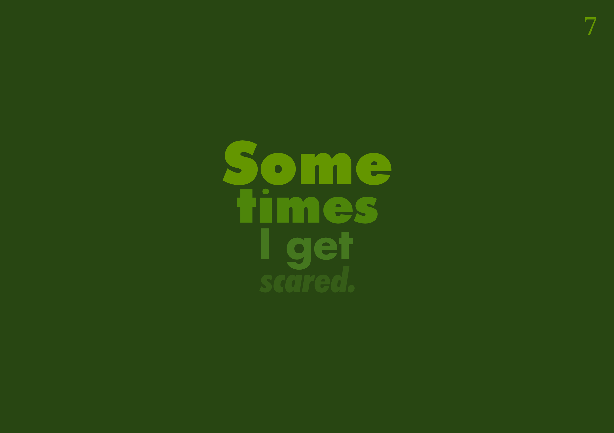
Fear
This has become one of my favourite pages. I started out adamant that I was going to have this page handwritten, for a raw feeling. However, after playing around with both handwritten and digital text, I liked the effect I could create with digital methods. I chose a grey background and used a gradient of greys to make the first word clearest and the final word – scared – not very visible. A bit like the change page, the person saying the words is becoming less confident, smaller, quieter, more afraid. I used all Futura typefaces, but bolder, heavier ones for the top words and lighter, slanted words for the bottom words. I also made the words gradually get smaller, so they form a kind of arrow shape on the page (like an eye sight chart almost). I really liked the symbolism behind all these choices – it was simple but very effective.


During the editing stage, I felt that the grey looked a little stark next to the deep green maze page. I decided to use some of the colours from this page to inform my gradient for the fear page. I adore the effect! Now it looks like the words are literally camouflaged and the pages work brilliantly together.
Mind
This has become another of my favourites. I had a pretty clear vision about this page from the start. Each word seemed to present a nice visual way of appearing on the page. I used Futura for the majority of the words, in a grey colour, to speak to the clean, sharp, urban lines of ‘modern mind’. The word ‘crowded’ was made of individual letters at various angles crammed into a space. I chose Old English Text for ‘old &’ (I trialled a few different ‘old’ typefaces, that looked like engraved text) and I hand drew the ‘dusty’ word, based on Perpetua. This was inspired by Elizabeth Willow’s type work – creating the word ‘dusty’ from specks of dust. I thought this was very clever and looked stunning.


For the word ‘furniture’, I came up with the idea of wooden building blocks. I was toying around with actual pieces of furniture, but I thought this could get too complicated. I took photos of wooden surfaces, then used these to fill blocks of different shapes, digitally. I altered the colour of the wooden surfaces by changing the hue, saturation, brightness and contrast. I really like how playful this page looks!
During the edits, I decided to slightly alter the grey palette of the top text to suit the greys used on the opposite page. It was a minor change, but I felt like it helped the pages work together a little more harmoniously.

Dreams
I wasn’t sure exactly how I wanted this page to turn out. I just knew that I wanted ‘dream’ imagery to be collaged, spilling out of eyes, ears, noses and mouths. I was scanning through magazines and came across the image of this woman, in black and white (which I liked, because it seems nostalgic). I played around with cutting out the eyes, nostrils and mouth shape, then placing space/stars/sky imagery behind these holes. It looked spooky and intriguing (kind of like a goddess is sometimes depicted with no eyes, just light or stars streaming out). I then decided to try adding earrings of these textures (the ‘waves’ or streams didn’t look as effective). I also added tear drop shapes from the eyes and a ‘splash’ at the bottom. This was heavily influenced by all the wonderful collage work I’d seen in various books – including Jean McEwan’s zines – and I felt it captured a surreal, dreamy vibe.

For the text, I used mostly Perpetua for the literature/narrative classic feeling, but used Transport for ‘dreams’ (the title of the poem) and made this bright blue. The text reflects the stream of thoughts that this sentence is (one long stream of words), using waves, staggered lines, ‘falling’ imagery. I tried to use the space and emphasise certain words with size, bold/italics and shape to help guide the reader as to the rhythm of the words.
Fragile
This was a tricky page to create – I’m a little annoyed at myself that I didn’t take any screenshots of the process, because it changed a lot! I knew I wanted the scribbled heart in the middle of the page. I changed the colour a lot – in the end, it became this highly saturated, bright heart (almost like it has been drawn with a sparkler and captured on camera). My longer poem is smaller in the right corner, because otherwise this dominated the page and looked too cluttered (I like it as a small thought – something harder to see, more secretive).
I loved making the ‘fragile’ sentence from ripped up words. I printed the sentence several times and then ripped them up. I pieced them together, layer by layer, to make the sentence again and scanned it in. I think it captured fragility, breaking and putting ourselves together again beautifully. I began with this being on a white background (kind of like Jean McEwan’s text on white pieces of paper) but then decided to invert the colours and make this blend in. It looks like the words are almost hovering, which is quite spooky and ghostly.

The handwritten words also stand out against the dark blue background. I played around a lot with the position of the rest of the words. My aim for this page was to make it look a lot like one of my diary pages (because it felt like a collection of small thoughts about falling in love that needed to be threading together). The end result is quite angsty, dark but vibrant and sharp. It feels like its charged with energy.

During the editing stage, I changed the colour of the top right text to make it brighter, because it was too difficult to read.
Meaning
Meaning began as page 11 but during the editing process I moved it to page 13. It started as a black and white page, which didn’t really work next to the ‘love’ page (it looked too stark). I also thought the hand drawn style of ‘cry’ would fit better, which I’ll talk about later.

I ended up changing the black and white theme for something more dreamy. I used a watercolour image of a night sky that I created to fill in the pen shape. I then inverted the colour of the butterflies to make them ghostly white on a dark blue/grey background. The repeated butterfly (with a few flutterbies thrown in, for my grandad, who used this nonsense word all the time) text that made up the other butterflies stayed the same. I had the text for this poem stream from the pen, gradually growing. I used Edwardian Script because I liked the flow and the rounded nature of it (it wasn’t as slanted as others and was much more readable than others too).

Friend
This page also took some fiddling around. I used a mixture of collage and digital text, choosing Perpetua and Stymie, for a very literature/typewriter feel. My first version had one of the lines ‘talking playing being friends’ in a curved shape, joining the left side of the image to the right side. My other text was around this, but the direction in which the reader was supposed to read did not seem clear. After showing it to others, they agreed that some parts weren’t clear and they weren’t sure about the order. For the most part, it didn’t matter too much in which order the phrases or sentences were read, as long as the final sentence was read last.

I decided to try having the ‘talking playing being friends’ coming from the mouths like they were being spoken, which felt like it fit better than the curved idea. It also made them snappier, individual phrases. I moved the text on the right side next to and below this, to create a third ‘column’ almost. When I showed this to others, they said they looked to the left top corner first and read these bits, then moved to the sky and started with the ‘talking’ ‘playing’ phrases, moving down the page to the end. This seemed good to me!

I like the colour combinations on this page, and it ended up working well with the dreamy pen and butterfly page, because of the night sky combination.
Cry
This page became page 11, to pair with the ‘love’ page, because both have a basis of handwritten text and continuous line drawings or scribbles. The basic structure of the page stayed the same – I was inspired by Egidija Čiricaitė’s ‘rain’ so I used individual letters streaming from the closed eyes, like teardrops, making tracks down the cheeks. Each word is a slightly different shade, with some brighter and some darker – some contrast with their background more, while others seem faded.


I tried so many colours, but I settled on quite a vivid blue to complement the ‘love’ page.

Helpless
This was a concept that took a while to generate in my sketchbook (everything that I tried sketching looked too creepy!) I ended up using shape poetry to represent the boy who makes me cry and the boy who makes me smile. It was really fun playing with the colours on this piece – the tears as vivid pink look so interesting (they remind me a bit of the ‘pink elephants’ scene in Disney’s Dumbo – where the bubbles and water are splashing around, in bright colours on a dark background).

During the editing process, one person pointed out that it was a little tricky to know where to start reading first on the lips, because the bottom lip starts before the top lip. I separated the lips digitally and moved them slightly further apart, so it would be more obvious to read the top lip first.

Opposites
This page was relatively simple to create. I used collage images of blue skies to make a window. The ‘sunny days’ text was in the window, while the ‘heart is dark’ text is in the darkness. The small ‘They won’t last forever’ is supposed to represent a small voice in your head, or in your life, the smallest reason that keeps you going, even in the most difficult times. I used Perpetua because I wanted the text to look like words from a classic novel.


During the editing process, I changed the black background to very dark blue, because the black looked too stark next to the ‘helpless’ page.

Glimpse
I loved making this page! I cut out lots of images of eyes from magazines and arranged them around my handwritten ‘eyes’ text to form a bigger eye. Once I was working digitally, I drew around this eye shape and created copies that were different shapes and sizes to surround the central eye. I think it looks a bit like a cobbled pavement, like a collection of items. I kept the ‘glimpses’ sentence small on one of these shapes, like a secret confession that is almost unnoticeable.

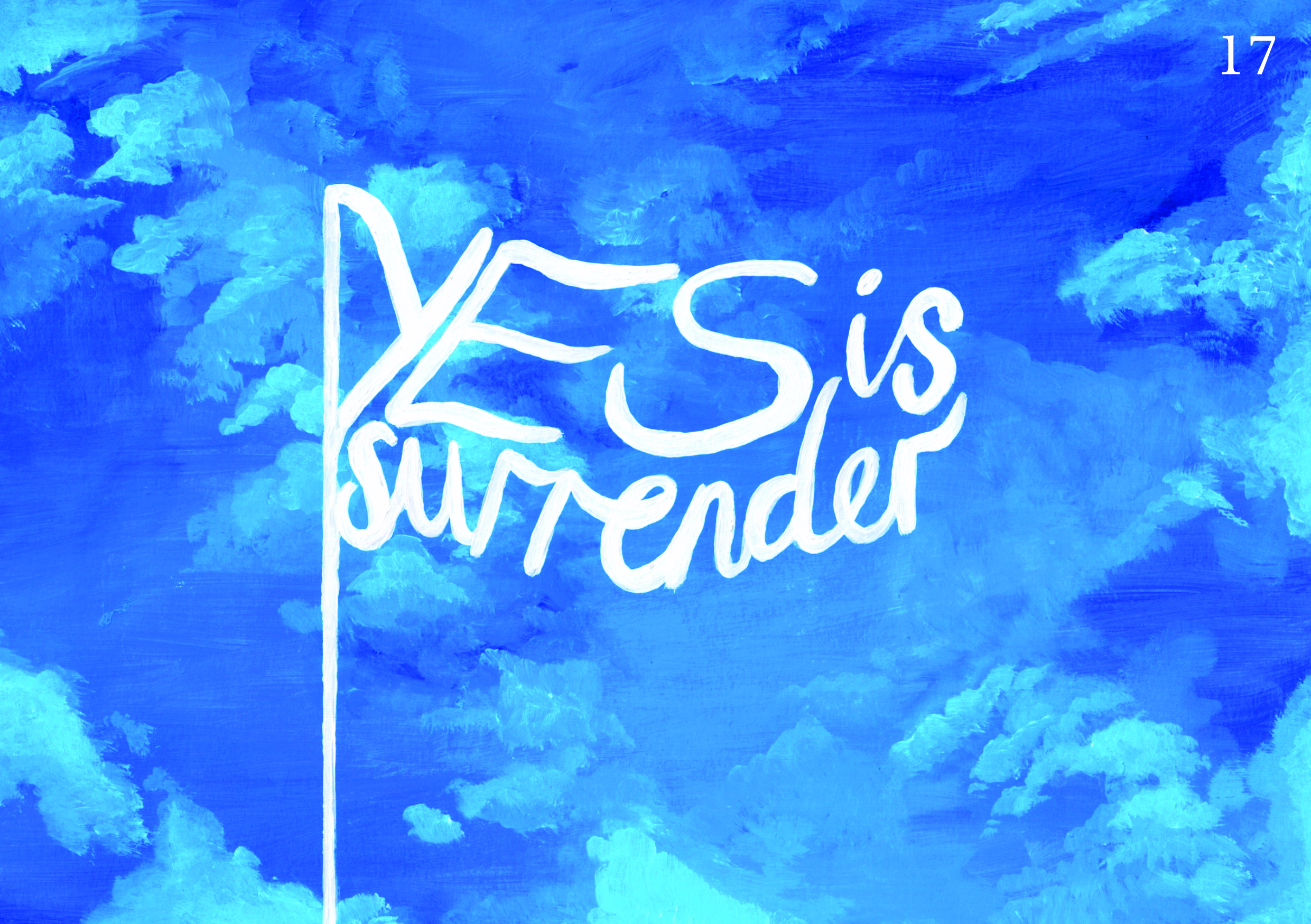
Surrender
Again, another page that was clear in my mind from the beginning. I painted an acrylic blue sky, with ‘yes is surrender’ in the shape of a flag. All this page needed was a page number and some alterations of the brightness, contrast, saturation and so on.
Lies
This was a fun page to make! As I mentioned, I wrote some words using strawberry sauce and photographed them and I also created the word ‘sweet’ from sprinkles and photographed this. I played around a lot with the colours – I wanted the food to still look appetising, so I was trying to use reds and oranges and pinks to stick with this sweet theme.


The background was tricky. Eventually I settled on a pale blue, because it seemed to let the other colours shine. The word ‘beautiful’ is in Edwardian Script – a ‘pretty’, loopy script font.

Stains
I think I made this page in a rush on a weeknight and then changed a lot after showing others. It began in lots of quite sickly shades of purple/pink (very girly – not very me) with half the poem above the ‘clear/stains’ and half the poem below.


After playing around, I decided to use Perpetua and Edwardian Script to highlight certain words, and moved the whole poem above the ‘clear/stains’ image. I changed the ‘stains’ to be vivid pink with some blue details (which fit better with the contents ‘spill’) and had the background a blueish colour. This meant the stains stood out more, which looked more effective. I also liked how the Edwardian Script seemed to float through the blue background like paint in a water cup.

Games
For this page, I took a photo of Scrabble pieces spelling out ‘games’ across the board as my background. I then created a Guess Who-style image using collage techniques to make surreal faces for the word ‘guessing’. For ‘gut-punching realisations’, I collaged together some innard-colours and textures – dark purples, reds and browns. I then hole-punched this and scanned it in.

During the editing process, the type for ‘gut-punching’ was highlighted by a few people. I needed something stronger, more impactful, to communicate the message. I chose a heavy Futura font for ‘gut-punching’ and used regular Futura for ‘realisations’, so it was clear (like the clarity you feel when you realise something).

Pretend
This page initially coupled with ‘games’ because of the similar themes, but during the editing process, I felt like ‘trust’ worked better with the greens and reds on this page, so I moved ‘pretend’ next to ‘broken’ – the collage on both pages seemed to work nicely.
I had quite a clear vision about this page from the beginning. I wanted to use comedy/tragedy drama masks, to link to the ‘pretend’ theme. To create these, I initially tried drawing them, but I knew my drawings wouldn’t fit with my book properly. I decided to try collaging the shapes – I chose vibrant natural colours for the comedy mask (greens, pinks, oranges and purples) and blues for the tragedy mask. When I was setting up the page digitally, I chose to use Perpetua – narrative/literature/classic feel (also the italics mixed with the normal text worked well to highlight certain words and create rhythm).

I struggled a bit with the colours. My first draft had a murky yellow background for the comedy mask, which I didn’t like at all. No one else saw an issue during the editing process, but I couldn’t help playing around. In the end, I think I realised that yellow does work, because it contrasts with the blue on the other side of the page. I used a slightly paler, brighter yellow, and purple text. I think the sunny yellow fits with the ‘happy’ side, while the dark, murky blue represents the ‘sad’ side better.

Broken
This one took a while to figure out, but once I had the idea for the page, I was excited to create it! I used images of water to cut into jagged geometric shapes, like shards of a broken mirror. The idea was for the ‘sadness’ or ‘sea of grief/tears’ to be reflected back at the reader. I added digital text (Perpetua again) in white, that is kind of broken into pieces as well, going at different angles on the different parts of the mirror. I particularly wanted to split up the words ‘you’ and ‘me’ (for some fun break-up symbolism!) I kept the final sentence small – a scared, timid thought to be read last. No edits were made to this page. I think it communicates the message fairly simply, but effectively.

Trust
This page took a little while to set up. Although I had been used a basic grid to help me structure the other pages (knowing halfway horizontally and vertically, the page number position, etc.), I hadn’t used a rigid structure because each poem expressed something different using a different method. For this, I had the idea of creating a ‘sign’ style page, using greys, red and green, and using the Transport typeface to really capture that style. It took a while to set up the grid, splitting the page into sections and ensuring I had enough space between each element. I kept referring to images of signs to inform my design choices. One of the decisions I made was to not use full stops (because signs don’t tend to). I liked the underlining of some of the words because it is subtle, but speaks to the sign style and does add some emphasis.


During the editing process, I decided to move this page next to the ‘games’ page because the colours worked better together, as well as the type choices. I like the snappiness of both poems together too.

Waste
This page was a quick one! I already felt like a raw, emotional, hand drawn poem would be best for this – to convey the frustration, upset and anger about the situation. It’s emotive and it allowed me to make the letters jagged, harsh and impactful.

I tried two versions – one with black ink on a white background and one with the colours inverted. I adored the inverted version, because it feels like the black ink is closing in on those very words, almost consuming the page. It is also dark – the emotion being portrayed.

Again
‘Waste’ and ‘again’ are my two favourite pages and I think they work really well next to each other. For this page, I used collaged images of pink/orange clothes for one side – this ended up having the first sentence above the collage. On the other side, I had my hand drawn and handwritten section. The pink palette was chosen because of the word ‘pretty’ – I always associate pink with pretty.

During the editing process, it was noted that the white text on the pink background wasn’t easy to see, so I changed this (and the page number) to a more vivid pink colour. I think this page works well with ‘waste’ because they both contain handwritten text, but they are the inverse of one another. I also like the colour scheme of pink, black and white. For me, these poems are emotionally significant too – the start of moving forward again.

Conjure
I was inspired by some of the handwritten text I’d seen in Michael Perry’s ‘Hand Job’, such as Jim the Illustrator’s ‘Blob Typeface’ and I felt this would work really well as inspiration for the word ‘monsters’. The other text was digital – I used Futura for ‘my mind’ to keep this bold and clean, for ‘princes’ I used Edwardian Script (so it looked elegant and regal), and for the rest I used Perpetua (like a fairytale, classic literature etc.).


I played with colours and backgrounds a bit, but anything I tried looked too childish, so I stuck with a green palette (quite subtle greens). I think the hint of child-like illustration speaks to the subject of the poem – it’s about how our minds can imagine things that aren’t reality at all, which links to fairytales, magic and anything else in that realm.

Strength
I started creating this page purely digitally, drawing a circle so that I could line up the edges of each ‘sunbeam’ of text with the curve to achieve a round, sun effect. I played with the colours of the text and then started trying things with the background. It all seemed too flat, so I decided to paint a purple/orange/dark blue sky background with acrylic paint to scan in. This really helped – I made alterations to the colours of the words to ensure they were readable and played with the size of some of the words too.


During the editing process, the page number was too tricky to see, so I made this a lighter purple. This poem holds a lot of emotion for me. I put it close to the end of the book because I feel like it symbolises an end that I revisit a lot and think about a lot (my nan having passed almost ten years ago) but it also symbolises a start too. I can remember waking up from this dream and feeling stronger. I wanted to capture that time of change with my sunset/sunrise imagery – something is ending and something is beginning.

It’s worth noting that these jpgs have come out in slightly different colours than my pdfs to print! You’ll see the printed colours in my flip through video and photos once the printed books have arrived.
Editing
I’ve discussed my editing choices in each page description, but I printed several mock ups and trialled lots of options. Here was my first printed mock up:


The lines and poor colour quality are unfortunately due to my home printer, so I tried to look past this and focus on the pages. I showed different people the book (on screen and printed) to check for errors, readability, layout and the overall effect of the book. Below were some notes I made after the first round of edits and showing people my first and second mock up.


I made some changes based on these notes. It involved switching the order around a little and some pages were recreated almost entirely, while others only needed minor changes. I didn’t photograph every spread here – just the ones that changes.


It was a process I was keen to go through several times, to ensure I hadn’t missed anything obvious. Once I’d shown people a few times and looked through it myself several times, I decided to get onto Mixam’s website. I chose my options for printing – an A5 landscape book, with silk pages and a soft laminate finish on the silk cover. The pages will be 170gsm. I used my Mixam samples to help inform these decisions. As I said before, the pages of most poetry books are uncoated, but I was keen to have better colour reproduction for my colourful, image-heavy pages. The soft touch laminate cover was important to me – I adore the feeling of this finish and think it symbolises the content of my book. It’s personal, soft, vulnerable. The softness of the cover will also make holding and reading the book much more tactile too.


When I started making my book on Mixam’s website, I saw other changes that needed to be made. For example, on the website, Mixam shows you gutter lines and bleed lines, which were hugely useful. On some of my pages, I made small adjustments to the position of content to ensure it wouldn’t be lost in the gutter. There was also a digital flip through option available, which was a brilliant way of checking the pages again (and again and again!)


One error that occurred during this process was that some images with transparent backgrounds had faint grey lines appearing around them once exported and on the site. After some troubleshooting, I tried rasterising the images, and this seemed to solve the issue!
Once I was happy with my book, I placed my order. I was pleased that I could go through the stage of checking the bleed, gutter and any other pre-printing issues myself. It felt like I was overseeing the process right up until the printers do their job. My order took a week to complete and arrive.
Final Printed Book
My books arrived!


I was very excited to see the final printed product. The cover immediately has an impact – both in colour and in texture (people who have taken a copy have commented on the pleasing softness!) The colours look amazing on the pages – I’m very glad I chose silk over uncoated pages. There is a little shine but the text is still readable and the minimal shine doesn’t disrupt the experience of reading through.


My only disappointment is that some of the pages have been cut slightly wrong in the making of the book – you can see doubles of the pages on the edges, like mirror images, and the occasional line on the edge of a darker page too. I took a few photos to show these details, but you can probably notice them in the flip through video. Although this is a shame, I had not control over this part of the process. Perhaps if I’d chosen a different printing company this wouldn’t have happened, but who knows? I am really pleased with the quality of the paper and the colours and definition on the pages – these were the choices I could make and could sample from Mixam.
Below is a slideshow of photos of the pages and also a flip through video.


Evaluation
What did I set out to achieve?
As I stated at the start of this assignment, my brief asked me to draw on all the skills, insight and experience that I had gained so far to design and produce a book of my choice. I chose to focus on visual poetry, using inspiration from my old random books and other visual poets. I delved into the different areas of visual poetry, including shape poetry, pattern poetry, concrete poetry and vispo.
My final book showcases poems that I wrote based on personal experiences at certain times in my life. This meant the subject was meaningful to me and this made me passionate about bringing the words to life on the page in a way I hoped reflected their meaning. I worked hard to explore lots of options for each page, settling on certain imagery and layouts that fit each individual poem. Some of my poems are shape poems (e.g. 14 helpless and 17 surrender) while others are more like pattern poems (e.g. 6 change and 11 cry) and others feel like concrete poems (e.g. 7 fear and 8 mind). There is a big mixture in there – I think I’ve managed to achieve my goal of playing with words to help communicate their meaning.
I wanted to draw inspiration from lots of visual poets, artists and book designers that I’ve researched during this course. My diary idea came from Delpha Hudson. Sam Winston’s A Dictionary Story was a brilliant example of playing with words, while Victoria Bean and Chris McCabe’s The New Concrete provided me with lots of examples to draw from and some more in-depth definitions of the types of visual poetry too. Jean McEwan’s collage also provided me with more direction – I wanted this style running through my book, as I felt it fit with the patchwork of memories, thoughts and emotions I was drawing from. There are lots more artists and pieces of work that have inspired this book, which I’ve mentioned throughout this blog and in my sketchbook pages.
My final product, I believe, fits the brief. I went through the whole process of ideation, research, content creation, design, edits and then sent my book to be printed. It is a book that shows off an area of interest – visual poetry – by using poems I wrote. It draws on lots of my research and skills I have gathered throughout this course. I would particularly highlight my digital skills – at the start of this course, I could never have created this book, because my digital skills were pretty much non-existent. I have learnt how to use DTP software and I think that shows.
How does my book compare with other books of a similar genre/style?
This is a tricky one, because my book spans a few styles. It is a poetry book, first and foremost. I based the structure on other poetry books I own, using a front and back cover, inside pages, then a title page and contents page. Each poem has its own page. Rather than group poems into themes (like Rupi Kaur, for example), I let mine remain as individual pieces. However, I spent a lot of time ordering the poems in a way that I felt gave the book an overarching narrative (from curiosity, growing up, change, fear, romance, love, hurt, healing and strength). The book also has consistencies in typefaces (even though several are used) and themes of imagery – lots of skies, stars and dreamy imagery, as well as eyes and collaged humans.
My book is also very visual, like an art book or a picture book. I could compare it to some of the visual poetry artists’ books I’ve seen throughout this course. It is similar to Jean McEwan’s zines in the patchwork of images, text and colour, but also feels much more polished than this (McEwan creates zines on uncoated paper, while my book has more pages, a soft laminate cover and bright, vivid, colourful pages). It’s also reminiscent of Jandy Nelson’s The Sky is Everywhere, with some real objects combined with poetry, like the ‘lies are sweet’ page.
The paperback, thin, small format is perfect for carrying around – it feels like an intimate book, rather than a huge, glossy art book that someone might call a ‘coffee table book’. It doesn’t feel intimidating or hefty – it’s small, light, soft and flexible. I like that is seems friendly in this way – as if the book is letting you into some secrets (linking to the whole theme and title ‘Spill’). In this way, it is similar to other artists’ books I’ve researched – lots of these are small, intimate and friendly, a little piece of the artist passed onto the reader.
What would I change?
I feel a little disappointed about the way the pages have been cut, but this is minor (and others have assured me it’s not as bad as I think!)
Some of the words on the pages seem to sit in front or over the images. I think I would like to find out how to integrate the text more with the page and the images, so it feels more organic. Perhaps some more textured, rough text might fit better for some of the poems, rather than always having clean, harsh lines and block colours for the digital text. This is perhaps a digital skill I need to look up and work on.
There are moments when I’m flicking through the pages and I think some of the poems stand out or feel inconsistent (for instance, 21 trust or 26 monsters). I tried to have consistency in the methods I was using (e.g. collage, acrylic painting etc.) and the typefaces I chose (e.g. Transport, Stymie, Perpetua etc.) so I did try to bring them altogether and make double page spreads complement one another. At the end of the day, these are individual poems and I didn’t want them all to look the same – the point of my book was to communicate each poem’s words visually, in a way that helped emphasise their meaning. I think I have achieved this.
I also wonder if I could have done something similar to Delpha Hudson and provided either an introduction or summary of my process – like an explanation to put the poetry into context. However, not every person does this – for instance, other poetry books just let the work speak for itself, as did Sam Winston with his Dictionary Story – so maybe it isn’t necessary. I do wonder if this would add to the experience of reading it.
To conclude, I am very proud of my Spill: A Visual Poetry Journey book for Assignment 5. It has been a labour of love – lots of hard work to bring a concept to life and I’m thrilled with the vibrant, expressive result.
