I chose to look at illustrators that use ink (fine liners, biro, waterproof ink, etc.) as I had a few in mind from picture books that I use when teaching. Some of the artists I found use predominantly black ink to create their images.


Cataloguing reflections
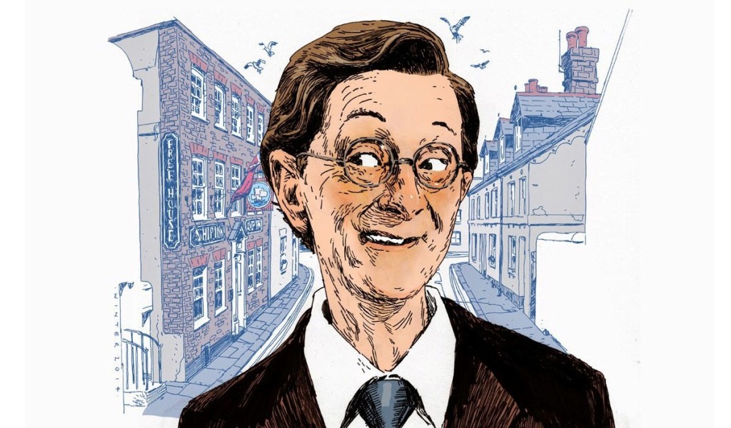
I decided to focus on illustrators that predominantly use black ink to create their work. Some of the illustrators use other materials alongside ink, so these can be grouped separately; for instance, Quinton Winter adds digital colour to hand drawn ink images and Eduardo Vieira uses coloured fine liners or pencils.
After taking a look at the images I had collected, a clear difference could be seen between the amount of detail added to an image and this usually correlated with the subject matter. Illustrators such as Quentin Blake, Quinton Winter and Eduardo Vieira focus on human characters and use fewer lines to achieve their style. In most cases, features are distorted to express the personality of the character and lines appear quick and expressive. On the other hand, Geoff Taylor, Andrew Paciorek and John Tenniel create more marks that are dense, orderly and give a much more detailed final illustration. The images I have found show animals and mythical creatures, or, in the case of Tenniel, very distorted human characters. Out of all the ink illustrators I have found, Taylor’s work is most definitely the closest to life, depicting real subjects in a style that is rich and detailed and truthful.
Keele’s illustrations fall somewhere in between; his characters are wonderfully expressive and he has clearly distorted features to exaggerate the expressions of the characters. The marks he creates are mostly lines – whereas Taylor, for instance, uses a variety of marks to achieve different textures and tones – but his style stands out because he also uses white lines and grey markers to further stress light and shade.
Eason’s style is also very distinctive. Out of this selection of ink illustrators, his images seem the most starkly ‘black and white’, with mark-making mostly used to add pattern rather than tone. The variety of marks are intricate and decorative. Distortion is used; in the image I have from one of Eason’s picture books, the room is upside down and a giant bug terrorises a lady. Everything seems to be curved or leaning slightly, alerting the viewer to the surreal nature of the image.
Sims also uses mark-making mostly for decoration and pattern, using digital methods to sometimes add colour. Although her work is realistic, there distortion is used to emphasise the perspective, as her images are used in comic books. For instance, the image where we as the viewer are looking up at a skyscraper; the angles here are very pronounced and the lines in the sky add an otherworldly quality.
Steinberg’s work is a unique mixture of detail and minimalism and I deliberately chose two images that showcase this. His subject matter varies; here, Steinberg has captured buildings and people at a party. Compared to the other ink illustrators, his style looks almost unfinished, due to the contrast in exact detail and vague outlines. He uses distortion which adds a lot of interest to an image; the buildings on the street are all at different angles, but this somehow looks as it should, and the characters at the party are full of personality.
Geoff Taylor
I chose an image by Geoff Taylor taken from the book ‘Wolf Brother’ by Michelle Paver. I can remember admiring these illustrations as a child reading the book.


Eduardo Vieira
How is the image composed?
Vieira creates an image that focuses on a character, then has “movement” lines around the character.
How are colour, tone and texture used to evoke mood or convey an idea?
A limited colour palette is used; Vieira tends to stick to warm, subtle colours, primarily oranges, reds and browns, with bold black outlines. These look expressive and slightly scruffy and the thickness of the lines varies to capture the pose of the character and also create a sense of movement. The use of a specific colour palette keeps a theme running through the images, and also suits these mischievous characters.
Has the illustrator distorted the content within the imagery and how does this work for the purpose the image fulfils?
The characters’ features are distorted to exaggerate certain aspects of their expressions and poses, which add to their personality. For instance, the clenched fist of the character is larger, and the frown and eyebrows are made a focus; this clearly shows the character is angry or frustrated.
My illustrations
I decided to choose this rose to render in the different styles as it allowed me to focus on the materials and methods without being too complicated. This was based on some observational sketches and photos.

I’m pleased with the black and white fine liner illustration in the style of Geoff Taylor. It was a slow, careful process, choosing marks and creating tone and texture with orderly patterns. Because I chose a subject similar to those used for illustrations in Wolf Brother – plants, animals and nature – it seems to suit the style better.

I found the style of Eduardo Vieira trickier as it was important to balance the colour with the bold, black lines. I stuck to the same colour palette, which suited the rose – some of the colours have been exaggerated. I added the colours around the rose afterwards, which help the rose to move further into the foreground. The most difficult part of rendering this image was deciding about the black lines. I added some to create texture on the larger petals and some to outline petals and detail. It was difficult to choose when/where lines should be bolder; I picked out petals that were larger or needed to move forward or be more in focus.
It was interesting and challenging altering the style of an image – I much preferred the black and white, but this is probably because I am generally more comfortable using black and white in my own work.
References
Matthews, C. & Matthews, J. (2004) The Element Encyclopedia of Magical Creatures. HarperElement: London
Roth, M. & Eason, R. D. (2013) My First Kafta: Runaways, Rodents & Giant Bugs. One Peace Books: Long Island City, NY
http://www.quintonwinter.com/Illustration/Faces2.html accessed 11/02/19
http://saulsteinbergfoundation.org/search-artwork/ accessed 11/02/19
http://www.brokenfrontier.com/cat-sims-xenos-black-matter-graves-space-elcaf-2018/ accessed 11/02/19
https://www.instagram.com/cat_sims/ accessed 11/02/19
https://www.instagram.com/kkeeleart/?hl=en accessed 11/02/19
https://twitter.com/plymptoons/media accessed 11/02/19
https://www.instagram.com/eduardovieirart/?hl=en accessed 11/02/19
https://www.geofftaylor-artist.com/node/1689 accessed 11/02/19
https://www.illustrationhistory.org/artists/sir-john-tenniel accessed 11/02/19
