My little book of…
This assignment brief asked me to create two books explaining and exploring the typographic and layout principles researched during Part 3. One book needed to focus on ‘good’ typography, and the other needed to focus on ‘bad’ typography. Each book was required to be an 8-page booklet, folded, stapled, or stitched.
Initial ideas
I began by picking apart this brief, looking at what would be required and highlighting key words for each book. I liked the idea of having two contrasting books that, in some way, mirrored each other. It was clear that I needed to show off everything I had learnt about good typography in one book and completely break the rules in the other book. It made sense to me that each book could focus on a few themes but show off two sides of the same coin (for instance, good spacing and poor spacing).

During these initial stages, I was also reading through Making Books (Goode and Yonemura, 2017) and came across a back-to-back pamphlet. This fit in really well with my idea of mirrored books, and would also allow me to create an upside-down book for the ‘bad’ typography book (literally, a topsy-turvy version of the good typography book). The two are linked, but also contrasting, so the joining concertina cover symbolises this relationship well.


Ideas generation
Taking on my tutor’s feedback from Part 2, I tried to use lots of sources of inspiration and many methods of generating ideas. I started by flicking back through my work for Part 3 and noting down features of ‘good’ and ‘bad’ typography in my sketchbook. From this, potential themes occurred that could be the focus of double-page spreads.
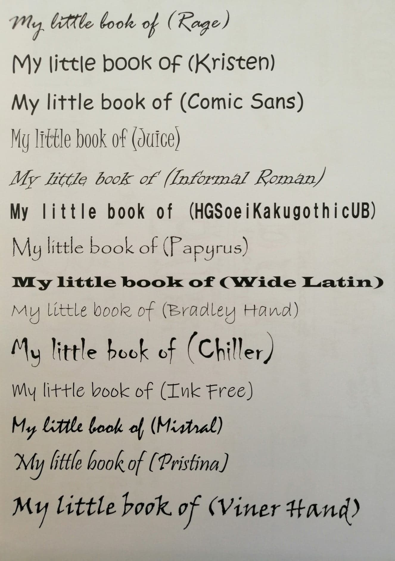
I also made notes about certain typefaces that were considered ‘good’ or ‘bad’. Derek Birdsall’s notes on choosing a font were particularly useful here, as he defined certain characteristics of typefaces that would work well in different contexts. I also checked my extensive research from the exercise ‘type samples’ to select typefaces that I did not like personally. A lot of the typefaces considered ‘bad’ were headline typefaces, overused, and a little weird. They would fit into perhaps the ‘decorative’ category and would only be appropriate for use as a heading or to fit a particular themed event or publication. For example, Comic Sans is used extensively for children’s worksheets in school (as a teacher, I become tired of seeing it!) and Trajan is the stereotypical movie poster typeface. They do work in certain contexts (as long as they also adhere to other typographic rules) but these particular fonts have been overused and are widely viewed as poor type choices because of this. What actually makes a bad typeface is the way it is used and what it communicates.


The brief discussed using quotes from designers; this was partially informed by my previous research and partly by new research. I jotted down quotes that I liked and started looking at which could match with ‘good’ or ‘bad’ themes (but at this stage, I kept it fairly open).
I knew it would be important to collect visual inspiration, as well as inspiration for the written content. I started with ‘bad’ typography examples, because I had already been pinning some inspirational, ‘good’ typography examples to a Pinterest board during Part 3. I stuck some of these examples into my sketchbook and, again, picked out themes. There were also lots of articles about particularly disliked typefaces, such as Comic Sans and Papyrus, that I knew would be useful for my own decisions around ‘bad’ typography. It was interesting to see how often certain typefaces came up – perhaps because we see them so much and they stand out, this makes them controversial. There were some good examples of type choices that had made words difficult to decipher (for instance, the ‘brand’ story, which can easily be misread as ‘grand’) and poor spacing between letters making words appear differently.

My research then turned to specific themed examples of bad and good typography and layout, and comparing the two (moving more towards the ‘mirror’ I had in mind). Again, this was useful to highlight particular themes I could focus on. For instance, I knew that I could demonstrate good and bad layout throughout each book, but specific examples, such as kerning or tracking, could have their own focused page. I continued to note that ‘good’ type choices equated to selecting two or three typefaces and using them appropriately (for instance, not using a bold, headline font for the main body, or a playful, jokey font, such as Comic Sans, for a formal document). The ‘bad’ type choices were specific, themed fonts, often headline fonts, and by choosing lots and mixing them up, this would make a publication difficult to read, unclear, and unfocused. The fonts would have to be used out of context and clash with each other to make the experience uncomfortable for the reader.

I also returned to my Pinterest board and kept collecting creative typography examples to inspire me.
In my sketchbook, I picked out a few key themes and started matching quotes to these themes. I spent a while playing with this and considering lots of options. Eventually, I came up with a loose structure for each book, with matching themes for each double page spread. I knew that I could ensure my type choices were ‘good’ or ‘bad’ consistently throughout my little books, as well as using, or not using, a grid structure throughout, but I had specific ideas for each themed spread.


To visually represent the kind of theme I was going for in each book, I created mood boards. First, I used my laptop to pick out typefaces and individual characters for each (using my research to inform this). For instance, Derek Birdsall’s notes on choosing a typeface came in handy. I also typed out some key words from the briefs and from my ideas generation in these different types, trying to represent these ideas in my choices. I kept everything black on white, because these mood boards were focusing on shapes and the actual type and even layout, rather than colour.

My type choices for my good mood board were, of course, influenced by personal preference, but also by my research. I knew that a balance of a headline font with a readable body font was essential. I also had seen combinations of serif and sans-serif typefaces that worked nicely, so I tried to include some of these. My notes influenced the words on my mood board (for example, I added the Berthold Wolpe quote about spacing and Phil Baines and Andrew Haslam’s advice about line length. All of these typefaces are readable and legible. There are some typefaces that jump out (often the headline fonts), such as Cooper Black, that are unusual, but are used sparingly for impact. I also increased the tracking on ‘luxury’ in Elephant to give that impression of space and a classy publication. I knew I wanted my little book of good typography to look professional and to stick to the rules, so the majority of type choices on this mood board are uncontroversial.

For my bad mood board, I allowed the layout to reflect the fact there was no structure and I wanted it to be trickier to follow and decipher for the reader. I chose lots of playful, decorative, and often headline, fonts that clashed and fought for attention. Some of these choices are my least favourite typefaces – such as Comic Sans, a typeface I get tired of seeing in the classroom! – but some linked to my research. I knew I wanted to pick some script fonts that were difficult to read and some other overused typefaces that I had discovered in my research. Bradley Hand, for instance, is very thin and so hard to read when it is too small or the colours do not contrast enough. Blackwood Castle Shadow is another typeface that is a struggle to read, due to the decorative elements, squished letters, and the colour choice could also impact that (the black and white looks like the letters are empty space). I also selected some typefaces that matched the words in the brief (for me), such as the ‘uncomfortable’ HGSoeiKakugothicUB that has inconsistent tracking and the ‘jarring’ Informal Roman, that looks sharp and yet playful at the same time. I knew I wanted my little book of bad typography to be rebellious and go against the rules. My type choices would be odd, clashing, and not appropriate for the context (for instance, using a heavy, headline font for the main body).
Throughout the rest of my process, I collected inspiration for the colours and general style of each book on Pinterest boards. My good typography book was initially intended to be romantic, perhaps like a sunrise, with some pale colours used (the little characters I developed informed this!)
My bad typography book was intended to be rebellious, chaotic, and colourful, but also grungy – a mismatch of colour and style. Both books had to clash.
Letter characters
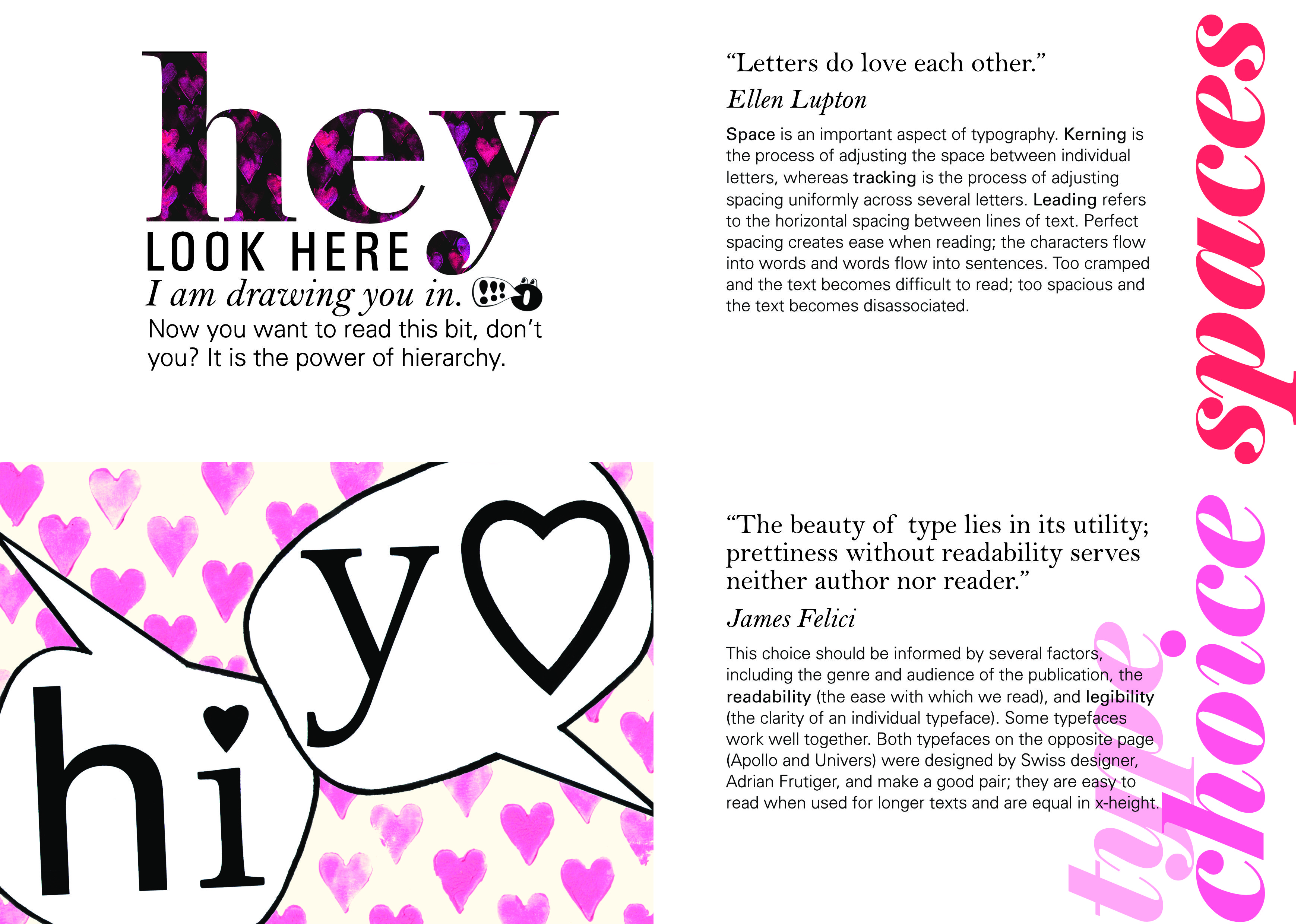
As I created the mood boards, I had the idea of using individual letters as characters (with eyes and personalities) that could help explain different typography concepts. It would add an element of fun and also another way of expressing the good and bad themes. My first idea, that prompted the rest, was ‘us’ being able to be close (characters are anatomically able to be close) and ‘we’ being further apart (because of the shapes of the letters). This was also inspired by Ellen Lupton’s quote, that I ended up splitting up to use in both my books – “Letters do love one another. However, due to their anatomical differences, some letters have a hard time achieving intimacy.”


I generated some options for this and started considering colour in my sketchbook. This also prompted other ideas for my layout and type choice pages. To be able to take my ideas further, I wanted to look at some examples of characters that aim to portray a trait or emotion – I immediately thought of Mr Men and Little Miss. I gathered a few examples of ‘good’ and ‘bad’ traits to analyse their facial expressions. I also thought about Numberjacks, which are numeral characters, and how these had been made to be friendly and real.


Another great resource I stumbled on during this process was typeconnection.com (accessed 12/01/21), a typographic dating game that helps you match typefaces together harmoniously (and explains why they work well together). It was created by Aura Weiner. I spent a while looking through the type matches and reading about why they made good matches. It helped inform the type choices page, with two types being mixed to greet each other. I tried a few different combinations, but liked Apollo and Univers the most. Through my ideas generation I tweaked the dot of the ‘i’ and the ‘o’ to be love hearts, linking to the overall romantic theme.


For the bad type choices page, I wanted to mix lots of typefaces that clashed and use typically disliked typefaces (by myself and the internet!) to create ‘rebel’ characters. I tried lots of combinations and then gave them all expressions and roles on the page. This was one of my favourite pages to create because I felt like ideas came naturally as I went along.


The layout pages also contrasted. For my ‘chaotic’ page, I had the idea (from my Pinterest inspiration) to use layers of the word ‘chaos’ to create a colourful, messy pattern to fill the letters ‘CHAOS’. I tried a few different typefaces to create the big word ‘CHAOS’ (I wanted this to fill the page) and also tried a few methods of layering the word ‘chaos’. I decided the felt tip pens worked best as they were vivid, bright, and could be layered easily and retain their strength of colour. It looked like a graffitied wall, painted over again and again, the artwork evolving. This also captured the rebellious aspect I was going for – graffiti often being seen as rule-breaking artwork. My book of bad typography was breaking the rules of typography.


For the good layout, I knew I would be using an underlying grid to structure my pages, but I also wanted to get in the idea of hierarchy of information and prioritising headings over the main body. I played around with a few ideas in my sketchbook and digitally. I also liked the idea of having a little character on this page to keep it interesting and maintain that consistency.


The next focus was the covers. Again, I wanted these to be similar but not the same. Again, I tried out lots of typefaces to see which combinations I liked (or which combinations looked terrible and could be used for the ‘bad’ typography book!) As I was exploring, I thought it would work well to have a sharper, harsher appearance to the bad typography cover (to fit with the brief of creating something uncomfortable and jarring) and a clean, well thought out appearance to the good typography cover. I kept the type choices to 3 for the good typography book (to be used throughout for the main text) – Elephant for headings, Bell, and Univers. I used lots of types for the bad cover, mostly sharper, wonky types, such as Juice and Rage.


Flatplans
After this exploration (and before lots more exploration) I created some quick flatplans to show my ideas about layout at this stage. I also created a mock-up using plain printer paper and a biro, just to help me visualise how the book would look, how it would feel to move through, and how to organise my layout for printing.


I liked the small size of A6 as this can be easily transported and flicked through as a quick advice publication. Also, the way the books are joined makes it interesting to turn the pages – it take some working out to flip the book over and rotate it to be able to see the ‘bad’ typography book the right way up.


Experimentation
I created various elements to use in the final books, and this involved some more experimentation. For the bad typography book, I already had quite a clear idea of how I wanted pages to look. I used watercolour paint to create a dripping page for the rebel characters (as if they had been running wild, spray painting everything in sight).


For the ‘chaos’ page, I traced the layout of the letters and filled the page with layers and layers of the felt tip pen word ‘chaos’. Although I wanted this to look chaotic, I did stick to about eight different colours to keep some consistency. These colours were eventually used with other pages in my bad typography book.


I also created some hand drawn typography for the word ‘deciphering’, based on the type I was inspired by in the book ‘Hand job’. The type was designed by A. J. Purdy, and I referenced this in my experimental typography task (exercise 3). I had a couple of attempts, but preferred the continuous line style, like a tangled piece of string.


For my good typography book, I wanted some romantic, love heart prints as a running theme. I created a few pink/peach/purple prints in various patterns that I knew I could play with and edit digitally. I then had the idea of using upside-down hearts on the spacing page for the ‘we’ characters, which stuck to my opposite theme. I used a turquoise-blue (inspired by the chaos pattern) on black paper, with the idea of editing later.


I also spent lots of time creating my letter characters. I stuck to black and white to make it easy to edit them later. I did, however, add some gold details to my ‘good’ cover and back cover.


It was also at this point that I decided to order the paper I wanted to use. I knew I wanted to use white paper and looked through my paper samples book to help me decide about the finish and weight. (My thought was to create the books at home and try getting them professionally printed later, when it might be easier to have a conversation with my local printers – lockdown dependent). I chose ice white paper, A4, that has a slightly rough finish, and is 150gsm. For the concertina cover joining the two books, I chose a contrasting black, with the thicker weight of 300gsm. I ordered from the London Graphic Centre to try out their paper, and was very pleased with the quality of paper delivered.


Digital process
I spent time scanning in the physical artwork I had created as .tiff files to ensure they were higher quality images to work with. A lot of the images needed to have the background removed; I did this using the brush select tool to separate the foreground from the background. Sometimes the ‘erase white paper’ tool also worked well. I also wanted to ensure the characters were high contrast black and white, which sometimes meant using the flood fill tool, and adjusting contrast and exposure.
For the bad typography book, I did not use any underlying grid system to deliberately ensure there would be a chaotic and awkward layout. I split an A4 page into four equal parts and the document had a 3mm bleed each side.

In contrast, I used an underlying grid system for the good typography book. I spent some time deciding what to use, but eventually calculated a golden canon grid (splitting the page up into ninths horizontally and vertically to structure the grid). My sketchbook pages show this experiment.


Bad – digital
I started by transferring some of the details I had worked out in my sketchbook experiments onto the digital document. The cover was fairly set, as I had already trialled some typeface combinations, and I had created the little devil horns for the ‘a’.

The final page or back cover was a little freer. I placed my ‘e’ character in the bottom left corner and used the pen tool to create wavy text frames. Later, I picked out colours from the other pages to use for each word and also altered the sizes of words so they would be inconsistent. For the word ‘bad’, I chose different typefaces for each letter to create even more of a random effect (some of the colours were terrible to be able to see against a white page [barely contrasting] which is another aspect of poor typography). My main typeface choice was Comic Sans, due to its playful nature and its general status as the most disliked font! Additionally, taking Derek Birdsall’s notes on choosing a typeface into account, Comis Sans does not have nice quotation marks, making it a great choice for a bad typography quote. The kerning was very inconsistent as a result of the wavy text paths, which fit well with the theme of bad typography and bad spacing.


My bad layout page was already quite clear in my sketchbook, but I did mess around with the ‘Invite the reader to participate by deciphering’ page more. I placed the ‘chaos’ image on the recto page and added the text ‘can attract and engage. David Carson’ as if it were escaping from the letter ‘c’. I chose the background colour of the chaos pattern as the colour for the text, to ensure it would stand out against the black. I also used the pen tool to create a curved path again and made the text bigger, so some ended up being upside down. This also meant the letters slightly overlapped, adding to that chaotic feel.


I had created the handwritten text for ‘deciphering’ based on inspiration from the book ‘Hand job’, so this was placed on the page. I then tried a spiral of text, gradually getting bigger, in a script typeface. I was not particularly happy with the ‘invite’ at the top of the page, so I played around with this. I ended up with the same word, increased opacity, and overlapping, inspired by David Carson himself.


The type choice page was my favourite! I placed the dripping red paint as a background and placed my ‘rebel’ characters over the top. This already looked exciting and full of expression, so I was really pleased with this. On the opposite page, I used a mixture of typefaces, with the majority of text being in Comic Sans, to create the Vignelli quote. Moving into Affinity Photo, I used a spray brush tool to ‘adapt’ the quote, as if the characters had spray-painted over it themselves. I also added some ‘eyes’ to the word ‘look’. This spread felt like the most expressive, fun, and very in-keeping with the ‘bad’ theme.


For the spacing page, I started with cutting the image of the ‘we’ characters to split across the double page. I tried the spray paint background again, but in blue, however I felt this looked too dark and I was not keen on reusing the same image on two pages. I ended up using the upside-down blue hearts, which still had a dark, grungy feel, but allowed the characters to take centre stage. The text was, again, in Comic Sans, and I went through and experimented with leading, kerning, and tracking (and also the size of the text).


Good – digital
To begin with, I placed images of my physical work in the grid structure. On the front and back cover, I broke the grid and had the content more centralised, but the grid was very much adhered to inside the book. I think having the central content on the front and back was more in-keeping with the mirror theme across both books. My type choices also remained consistent; I used Elephant for headings and Bell and Univers for quotes and main text.


I played around with the layout for my text pages – the idea was to have an illustration verso page and a text recto page. I ensured the quote and my text remained inside the grid I had created. The Elephant heading to establish the theme of the spread travelled vertically from the bottom of the page to the top of the page on the right-hand side. This took a little altering. I changed ‘kerning’ to the more general ‘spaces’ because I felt this reflected the content more accurately across both books and gave me more to talk about. I started out with the headings being black, but I knew I wanted to change them to fit the colours used in the illustration. For ‘type choice’, I used the opacity tool to make the word ‘type’ still visible behind the main body of text but not a clash.


The layout page took a lot of adjusting as well! The little ‘o’ character seemed out of place and I did not want to distract from the main text of ‘hey’. I tried lots of different solutions and different layouts, while also striving to include the hearts pattern I wanted as a theme throughout the book. There were some issues with legibility and I still was not sure about the little character. I wanted the continuity of my characters appearing through both books, but also I did not want to take away from the text design.


I quite liked the hearts pattern making up the word ‘hey’ but it was too pale and did not allow the word to jump out enough. I went back and edited the print to make the background black and the pink/purple a little brighter and more saturated. This looked so much more eye-catching. I also made the character much smaller and moved it to inside the grid. This allowed the text to be the focus.


The other pages were simpler. For the type choices page, I added the pink print behind the ‘hi’ ‘yo’ speech bubbles and used this pink to add colour to the heading. The spaces page involved adding the peachy/red print behind the ‘us’ characters and, again, using this colour to inform the heading colour. It was certainly quicker to layout the good typography book due to my underlying grid. There were fewer decisions to make because there is consistency and continuity.


I redrafted my text a few times and decided to make some of the key words a little heavier in weight. This established the ‘non-fiction’, informative genre.

Printing and binding
At home, I spent some time making mock-ups and seeing which settings on my own printer could create a decent home-made version. I also adjusted the measurements of my black cover that joined the two books to ensure it contained the pages and provided a level of protection. It also gave me the opportunity to practise binding the pages to the cover, following the guidance from ‘Making Books’.


Below are some photographs of my most ‘final’ mock-up and a little video flip through.


I managed to contact my local printer remotely to have the pages professionally printed so I could create a final version. I chose 160gsm paper, with a matte finish (to aid readability and avoid shine). This was trimmed to be the intended size, with A6 pages, and so I adjusted my measurements for the concertina, back-to-back cover. I was absolutely delighted with the difference in quality between my home printer and my local professional printers! After doing so many experiments at home, it was wonderful to see my designs in this quality.


I took a few comparison photographs to show the difference in size between my home mock-up and my final book. It was so useful to have my mock-up there and to have already tried the measuring, cutting, and binding process before creating the final book.


Below is a little video showing my final books. I am delighted with the way the colours show and the smooth texture of the paper too. The pages slip past each other easily, but they also feel thick enough to be strong and durable.
I also created digital mock-ups of my two books. Below are the pages from my good typography book.


Here are the digital mock-ups of the pages from my bad typography book.


Reflection
Overall, I’m delighted with my final two little books of typography. I feel like I have learnt so much during Part 3 and developed a real interest in typography, so it was wonderful to channel this new understanding and passion into a project.
My little book of good typography uses an underlying golden canon grid, minimal typefaces that complement each other, and a minimal colour palette. I tried to balance illustrative elements with the type and use quotes to inspire my content. There is still that mixture of my handmade style with digital, which I think adds a cuteness to the book. The little letter characters running through the book also make the content seem friendly and accessible to anyone flicking through the pages.
In contrast, my little book of bad typography breaks all the rules set out by its counterpart. There are lots of typefaces used and mixed inappropriately. There are lots more colours that often clash and sometimes make the text difficult to read. There is no underlying grid structure and the text often starts and ends in unexpected places. The spacing is completely random – sometimes the letters or words are too far apart and sometimes they are too cramped or overlapping. It looks chaotic and messy and is uncomfortable to read.
I found I enjoyed creating both books side-by-side as any ideas for one fed into the other, but just needed to be contrasted. It was liberating to break the rules I had learnt about; I think the experimental typography and unstructured approach is more enjoyable.
I would like to continue working on refining my digital skills and playing with different layouts. I think, in a sense, I played it very ‘safe’ with my good typography book, trying to adhere to the rules and not create anything too controversial. I have discovered lots of exciting, engaging designs during Part 3 that still represent ‘good’ typography but perhaps include more colour, overlapping elements, and imagery. I think I’d like to explore how I can bring together aspects of both my good and bad typography books to create something of a balance.
I’m really looking forward to taking my new typography understanding into the next part of the course and exploring it further in the future. It was so interesting to learn about!
Returning
After receiving my feedback for Part 3, I was encouraged by my tutor to evaluate my assignment against the brief and also against examples of best practice. I wanted to ensure I had tried this process for Assignment 3 before moving into Part 4, as I would like to strengthen my evaluation skills before going ahead. My tutor gave me some questions to consider and advised me to pick some examples I had collected in earlier research against which to compare my assignment books.
What did the brief ask me to create?
The brief: Create two books explaining and exploring the typographic and layout principles you have researched in this section. I created two little books of typography, one showing off good typography and one showing off bad typography.
Does each book provide comparable information?
From the beginning, I knew I wanted my books to, in some way, mirror each other; my final books have matching themes for each double-page spread.
The layout page in the good book shows hierarchy of type choices and displays the golden canon grid structure (as does the rest of the book) whereas my bad book is ‘chaotic’. There are too many type choices, too many colours, overlapping type, and type going in all directions. I would definitely say that the layout focus could be clearer in the bad typography book – I tried basing the whole page around the quote itself, when actually I could have had some descriptive main body text over the top of this (that would also add to the confusing layout).
The type choice page in the good book shows my research about pairing typefaces. Again, I stuck to a grid structure, using the same type choices for the heading, quote, and main body, for consistency. I think my text explains the accompanying type illustration, but perhaps on first glance, the theme of ‘type choice’ is not quite obvious enough. In my bad book, the type choice page shows a large range of typefaces being used to depict ‘rebel’ characters and an adapted quote by Massimo Vignelli. Again, it is not as clear that the theme of the page is about type choice (apart from being hit with such a range of typefaces immediately!) but I think as my intention was to make the bad book harder to follow, this fits with the rebellious theme. I demonstrated the chaotic result of using too many typefaces on this page, but I could have used some descriptive main body text to explain this to the reader.
For my spacing spread, I used a Lupton quote, but split over the two books, so I feel like this works really well as a ‘mirror’. Both sets of characters were created using Cooper Black (a typeface that flows really nicely from one letter to the next) so they could be easily compared (providing comparable examples for the reader). I also used the heart print background for each; red hearts for the good spread and upside-down blue hearts for the bad spread. Once again, I only used the quote in the bad book with no descriptive text. I wonder if, by adding a paragraph to each bad double-page spread, this would have linked the two books together better? However, I do think the theme of spacing is clear in this spread.
The covers are comparable; I used a very similar layout, with the word ‘good’ and ‘bad’ the dominating type, and used angel/devil symbolism to help establish the good/bad theme. I limited my type choices for the good cover (again, sticking to Elephant for the dominant word, Bell and Univers) and chose lots of typefaces for the bad cover. I wanted the bad cover to look harsher, while the good cover looked more professional and inviting (I think I achieved this).
Similarly, the back covers were quite comparable. I used a quote on each from Paula Scher to help this. The good layout was central with two typefaces (Bell and Univers) being used for the quote, and an angel character on the back. For the bad cover, the text followed wiggly lines, making it ‘rebellious’ (or that was the intention). There were also lots of colours and typefaces used, clashing and seeming thrown together. The contrast between some of these did not (intentionally) work well against a white background to make them difficult to read. I also included a crazy character on the back.
Overall, I think my intention to make the books comparable was there, and is definitely clear on the cover. Although I attempted to mirror the themes, I think either a heading or an explanatory paragraph in the bad typography book would have helped establish the theme of each page. However, I did want the bad book to be more free, rebellious, and chaotic, and this, I feel, has been achieved, when comparing the two books. The good book looks clearly laid out while the bad book does not have the same non-fiction feel – it is almost like a wacky, expressive picture book.
Do the final designs make clear distinctions between good and bad type design and typography?
I was delighted with the professional look to my good typography book. I think the layout helps the whole thing to look like it has been well-designed. My type choices were kept to a minimum, with a headline font being used for each themed heading, a serif font being used for the quotes, and a sans-serif font being used for the main body of text. I added a few different choices for the characters in my illustrations, but I feel like these are separate enough to not distract too much and ensure there is a consistent theme running through the book. Overall, I feel I showed off my research and my understanding of good typography effectively in this book.
My bad typography could perhaps be interpreted as expressive or fun, rather than bad. I certainly tried to include ‘bad’ type choices and design in the book. For example, I did not use a grid at all, meaning the layout was free and sometimes confusing to follow. I deliberately chose too many typefaces that clashed. Some of these were inappropriate for main body text and some were types that I felt were difficult to read. The spacing between letters, words, and lines of text were inconsistent, and I deliberately started lines of text at different points on the page to make it difficult to follow. Some of the colours used were not harmonious and did not contrast enough with the background, making them difficult to see.
I would say that my books did demonstrate good and bad typography, but my bad typography did not explicitly demonstrate bad typography. Without explanations, the book does not instruct or give the reader an idea of why the choices have been made. It also means there is not as much typography in the book, so less chance to demonstrate bad typography. I think I could have included a short paragraph on each double-page spread, as I did in my good book, to clarify the theme, explain the bad choices, and make it clear that the book is non-fiction. It would also make the books more comparable as mirrors of each other. Although my intention was there, it is not explicit to the reader.
Comparing
I picked out a couple of examples from my typography Pinterest board that show a balance of illustrative elements and clearly laid out type. This was the vibe I was going for with my good typography book.


These layouts have a strong, dominating typeface used for the heading – this is the main area of the image that is expressive in Kyeong-Soo’s work, with a hand-made print feel. The illustrative element in Stewart’s work shows a sea of letters at the bottom of the page. Apart from these expressive elements, there is a clear grid structure for the rest of the content. The type choices are not controversial and there are only a couple of typefaces used on each page. Additionally, the colour choices are minimal and the text is visible against the background, due to a good contrast. Everything is easily readable and legible.

When I look at pages from my good typography book, I think I mostly hit this balance. For example, this type choice spread shows minimal colour choices – the black and white contrasts and dominates, while the pink adds interest. I used a bold, more expressive typeface for the heading (Elephant) and this is another pink element, while the quote and main body of text is more conventional and uncontroversial. Bell has complementary italics and looks good with Univers. There is an illustrative element on the verso page, but it is also simple and in-keeping with the theme. Everything feels harmonious and well-laid out. Like Kyeong-Soo, I used a handmade print for my illustrative background, which I think works okay with the rest of the digital design. It adds a cute and friendly feel.
Next, I picked out some more ‘chaotic’ designs, to see how my bad typography book compares. Picking out bad typography examples was trickier.

This was the chaos I was going for. This is eye-catching, but also awkward to read and takes a while for the reader to work out what the poster is saying. There are lots of typefaces used, lots of sizes, and the text goes off in lots of directions. The very small text is difficult to decipher (probably not helped by the way it has been printed). Although I would not say this is ‘bad’, it is certainly more difficult to read, which was an aim of my bad typography book (the brief specified ‘uncomfortable’ and ‘jarring’).

Again, this is not bad. But it shows off odd spacing and makes the reader’s journey a little different to normal. It is much more expressive (and yet still simple).

I chose to compare my bad typography spread about type choice, for a fairer comparison. As with the example from Zdanevich, there are lots of different typefaces used. The bolder, heavier typefaces are the most striking or dominating, and because all the typefaces are so different, they clash. Parts are tricky to decipher, mainly due to spacing or being covered with ‘spray paint’, so perhaps I could have aimed to choose a typeface that was trickier to decipher for the main body (Comic Sans, although my personal least favourite, is very clear and easy to read – hence why it is often used for children’s worksheets in school). Similarly, some of the letters have been manipulated in the Nike advertisement to make the result a little trickier to follow – perhaps moving letters onto new lines and splitting up words/hyphenating words that are not hyphenated would have made for a more uncomfortable experience.
Overall, I think this comparison has supported my evaluation against the brief and my tutor’s questions. My good typography book does display and explain good type design and typography, but my bad typography book could have demonstrated more.
