Type samples
This task asked me to explore typography by carrying out several activities. I found that the more I explored typography, the more I wanted to find out about it. There is some extra research included in here about specific typefaces and how layout can play a big part in design too.

First, I had to find as many examples of type as I could from a range of sources. I searched through old magazines and newspapers, as well as collecting packaging, leaflets and flyers that came through the door. Of course, I also looked at books. I did a brief bit of analysis of a few choice pieces, then stuck them in my sketchbook. I then photocopied these pages and classified them into serif and sans-serif. I think this spread has a big visual impact – it is clear what the key differences are between the two groups, even if you do not know any technical terms.


I then looked at the seven ‘International Paper’s Pocket Pal’ categories of type to see if I had any of the typefaces mentioned. Using these as examples, I searched for others that fit the categories and created pages in my sketchbook. Again, this was a valuable exercise and I got quite carried away searching through and trying to categorise each typeface. It helped to make the size larger so I could see the little details (such as whether the serifs were pointy or blocky).


I kept annotating the type as I went through each task, with any observations or words I associated with the style.
Next, I chose five typefaces from the collection I had gathered – these were deliberately very different from one another, so I could explore contexts in which they would be appropriate and in which they would look wildly out of place and be unfit for purpose.

I started by trialling the types in different parts of a newspaper. I found a recent newspaper cover, with various types used – for the name of the newspaper, the headline, the lede paragraph (spelt this way to avoid confusion with ‘lead’ in the printing process), and the main body of text. I deliberately chose The Independent because they are, as the name suggests, independent of any political or social bias (although will still show bias based on their own beliefs etc.), and so the appearance of the newspaper is a little different.

I tried out each typeface in each section of the cover to see how it would look (all these experiments were done using Word and just placing the text in my chosen type over the top of the original). My notes in my sketchbook comment on legibility and readability, as well as the overall appearance in keeping with the newspaper. When comparing the modern and old style types, it is worth considering whether they will be printed onto physical paper or whether they will be read on screen – the old style type is much clearer on paper because of the consistent stroke weight, whereas the modern type can be more difficult to read on paper (depending on the quality) because of the contrast in stroke weight. Typically, newspapers are printed on uncoated, thin, low-quality paper so they can be printed cheaply and in large quantities. This is probably why old style type is used because it is easily readable on this paper.


Next, I looked at a science book cover – Human Universe by Brian Cox and Andrew Cohen – to see which types would suit this. The original type used is sans-serif, with sharp edges, and also the letters are far apart, to give the impression of space. Again, I annotated my sketchbook as I went, and noticed that the old style type worked quite well. In contrast to the sans-serif (which also looked appropriate), it gave the impression of history and learning and also looked professional and academic. It was also, again, easier to read than the modern type. The script looked too casual for the subject and style of the book, while the text letters looked like a clash (it reminded me of religion and history, rather than science).


I tried a magazine cover next, which was a template rather than a real magazine cover. I wanted something that could potentially be malleable and perhaps give the impression of a different audience and genre depending on the chosen type. The original template used a modern type, which looked elegant and sophisticated. It made me think of a fashion magazine, something a bit more upmarket. It was interesting to see how the different types worked here, because I think they all could work depending on the content. The old style type gave me a wedding/homes magazine vibe, whereas the script type made me think of well-being magazines (more personal and friendly). I also liked the text letters type, because it somehow fit perfectly with the title ‘Unique’ – I can imagine it being a magazine focusing on alternative fashion or lifestyle or maybe even music. The one type that I did not like as much was the sans-serif type; it looked far too plain and simple to fit the title ‘Unique’. It would be perfect for the other text on the cover though, being easily readable.


Finally, I wanted to pick something a little different, so I chose an instruction manual. It was the perfect match for a sans-serif type, but some of the types were SO wrong for this purpose! It really highlighted the importance of readability and legibility; this publication needs to be informative and clear, without any form of decoration. Everything about it needs to be functional.


Throughout my sketchbook, I made notes and used words to describe the typefaces, with my printed examples and the typefaces I collected from materials and collaged. I also went through my sketchbook and traced a range of these typefaces onto clean paper. This helped me to see the thickness of the strokes, the serifs (or lack of), and the way the letters worked together. I coloured inside the letterforms with a pencil to give the impression of print.


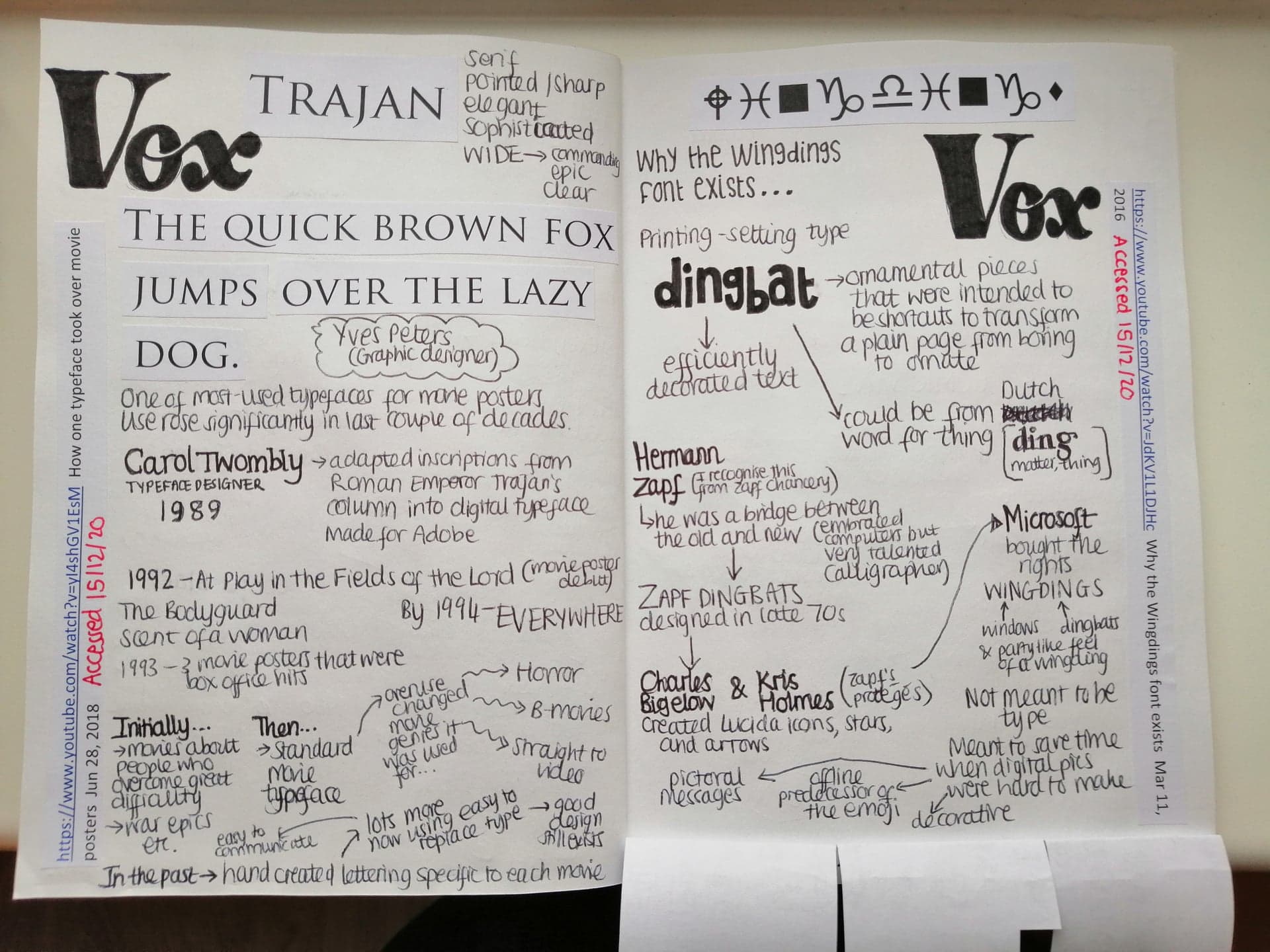
I managed to easily fill an entire sketchbook with my explorations (I had to stick extra pages inside!) because I thoroughly enjoyed learning about type and finding different examples to analyse. Below are the extra bits of research I did, which helped me to understand more about the formation of new typefaces, gave me an awareness of previous printing processes, and also more examples of uses of type. I also included my notes based on the course materials here too.


I have very much enjoyed this task and I know that from now on I will notice type more and analyse it in its environment and context. It has also given me more insight into the history of printing and why layout is important, which is something I will be exploring in more detail in the next task.
