Sequencing images
This brief asked me to follow a process to create images inspired by the poem ‘Tango with Cows’ by Vasily Kamensky. Using my interpretation of the poem as a starting point, I was asked to develop a set of images that I could sequence into a narrative. As explored in the material, a narrative can be linear or non-linear, conventional or less conventional. The brief stated I could create new images or use existing images.


I started by breaking down the brief and highlighting any key words. The main message of the brief was to explore and experiment, especially when it came to the development process. I was keen to continue developing my use of digital software, so I made this a priority. I also knew I wanted to use a mixture of hand drawn illustrations and photographs (preferably my own, but some that I had gathered from other places). The process was broken down into ideas generation, followed by research and development.

Ideas generation
First, I copied the poem and went through it again, picking out phrases or words that sparked ideas. I also noted down my overriding interpretations of the poem from the previous exercise – I still wanted to ensure my imagery showed clashes. The urban and rural themes are strong and I thought they could be interesting to explore visually. I also wanted the imagery to be quite abstract and surreal. My moodboard showing these futuristic and traditional themes also made me stumble across the idea of nesting dolls – I made a note to explore these further in my research.


Using the phrases I’d picked out, I gathered images and created little sketches of ideas in my sketchbook. In some cases, my imagery was very literal, but I tried to come up with several ways to portray a concept. For instance, the word ‘look’ in ‘we look at our destiny’ caused me to think about eyes, telescopes and glasses. The ‘tinned mirth’ line lead to ideas about laughing faces, mouths, or simply using the word ‘ha!’ One of my favourites to generate ideas for was ‘kings of orange groves and cattle’. Using images searches and word associations, I came up with chess pieces, playing cards, crowns and even religious themes. It was really useful to collate these images I had collected from free online sources and magazines – it gave me inspiration for patterns, colours and shapes, as well as actual image references (like the husky for ‘dog’).


Even during this process, I could see the benefit of bringing lots of elements together on the page, and I was keen to include some key words or text in my imagery. I wrote the phrase or line in a different colour for each page. I enjoyed the play involved in combining clashing items together – like the cow in heels, or the comet in a wine glass.
At this stage, I wasn’t ready to create the 2-sided folding document mentioned in the brief – I decided to try this once I had done more research and established a more consistent style to bring together the narrative. I knew it would be beneficial to see how my images would interact with one another in a folding document at a few points in the process though.
Research and development
I had lots of ideas from my moodboards, but I wanted some artistic inspiration and some context to help. I had already touched on Cubo-Futurism in Russia and decided to go into more detail. I also looked into the history of matryoshka dolls, or nesting dolls. The doll research I feel could be beneficial to return to when I come to folding and binding – I wonder if I could create a book structure that involves opening up each image to reveal another? It also make me consider the way my images might interact on one page – could one image be inside another? For example, the orange in the cow’s mouth, or the comet inside the wine glass.

It was my research in some key Cubo-Futurists that really inspired me! I came across Kasimir Malevich, who created collage works of art, combining paintings, blocks of colour, patterns, images, and objects or items totally detached from their original context. I loved the structure of these pieces – the majority of the detail was focused on the centre of the page and the shapes were mostly blocky and geometric. This appealed to me as I could imagine combining some of my own illustrations with photographs to create 14 collages that could span a 16-page book. It gave me a clear style to try to emulate and a link to the context of the poem – but I also wanted to experiment with digital software and make the collages my own.


The surreal style had also crept into my ideas generation, and this felt appropriate for the poem. My interpretations in the previous exercise had focused on the playful nature of the poem – the imagery is sometimes funny and absurd and the whole mindset of futurists was to play with traditions and embrace change. I wanted to keep the fun and playful element of my ideas in the final images.
I drew some thumbnail ideas in my sketchbook to see how I could create collage-like images for each phrase. It was valuable to play around with my ideas and consider what could be done. I didn’t want to restrict myself too much at this stage though – I wanted to be able to do lots of experimentation on Affinity to create images that took my initial ideas and brought them together.


At this stage, I decided to try creating some folding documents with these initial ideas in mind. The brief confused me a little as I knew that I would be creating and binding the book in the next exercise. I interpreted this step as a form of exploration – trying out different folding methods and making tiny mock-ups using my initial drafts. These would come in handy for the next exercise and I also wondered if I could try out my more final images in these folding structures further on in the exercise.


I checked Part 2, as the brief specified, and this had discussed accordion folding and a gatefold, so I made a note to try these. I also found this visual guide to a few simple folds. I created some tiny mock-ups and considered where each image might fit (for instance, some of the pages open up to reveal a double sized image or two images – I wondered which might complement each other or clash). I really liked the gatefold and the parallel double fold, which I had joined to create a kind-of gatefold.


The reason these two appealed to me is because they incorporated that ‘image within another image’ concept that linked to the matryoshka dolls. The parallel double fold was the most interesting to interact with, because there were several ways of unfolding and refolding the pages, to hide and reveal different images. I decided to come back to these after creating my images.
Creating illustrations and taking photographs
The next stage involved creating illustrations and going out to get photographs of what I could (I did this during a national lockdown, so was unable to travel far or go to any specific location just for photographs. I had really wanted to get photographs of people dancing, but this was not to be!)
My illustrations were created with a mixture of materials, as I wanted to emulate the mix and match style of Malevich in his collages. Some of my favourites used fine liners and colourful pencils as they really stood out and most of them were quite silly and playful (such as the cow dancer). I also created some collages of paint and maps with specific phrase in mind. My watercolour experiments proved useful for background textures. Below are some examples of my own illustrations. I scanned them all in as tiff files to ensure they were high quality to work with digitally.


I was able to get photographs of some of the items around my house and around my local park. Luckily, there had been lots of ice and snow for a brief period of time (which helped with some of the phrases) but it was also clear and bright too. For any photographs I couldn’t capture myself, I used images I had found on free services. I wanted to try to get as many of my own images as possible to fit the brief – to make my imagery meaningful to me. Below are some examples of my own photographs.


Digital experimentation
I was keen not to follow my thumbnail sketches too much, because the brief specified that I should experiment and explore – it was an excellent opportunity to learn more about what I could do using Affinity. When starting each image, I usually built up blocks of texture and colour to begin, then added my cut-outs of illustrations or particular features. The process of cutting out my illustrations or particular parts of photographs took the longest. I used Affinity photo and the selection brush tool to achieve this.


As stated in the brief, I experimented with lots of features, including opacity, filters, hue, brightness, and contrast. For some of the ‘space’ themed images, the invert tool and the saturation adjustments came in handy – they could sometimes create a ghostly or luminous effect. I also used the hue adjustment tool to match my images and create a more harmonious collage (a good example of this is my tinned mirth image or my diamond blood image). Sometimes it was a tiny change – such as the hue on my glasses on the ‘look at our destiny’ page. I also used the colour pick tool to choose colours for flat blocks to balance the composition.
I am probably most proud of my use of typography. I experimented with my type choices for each image and also used lots of different techniques to make it part of the collage. Sometimes I rasterised the text and used the warp tool to change the shape (like the ‘squeal’ sound coming from the sparrow’s beak, or the ‘to’ above ‘hell’ in the black cloud). Sometimes I used the pen tool to draw a particular path for the text (like the ice ‘floe’ or the ‘dance’ in the tango image). Sometimes I simply typed the word and adjusted the size and position. I found that it sometimes looked effective to make the text part of the negative space (like the ‘look’ in the destiny image) and I liked placing the text close to the edge of photographs or blocks of colour.
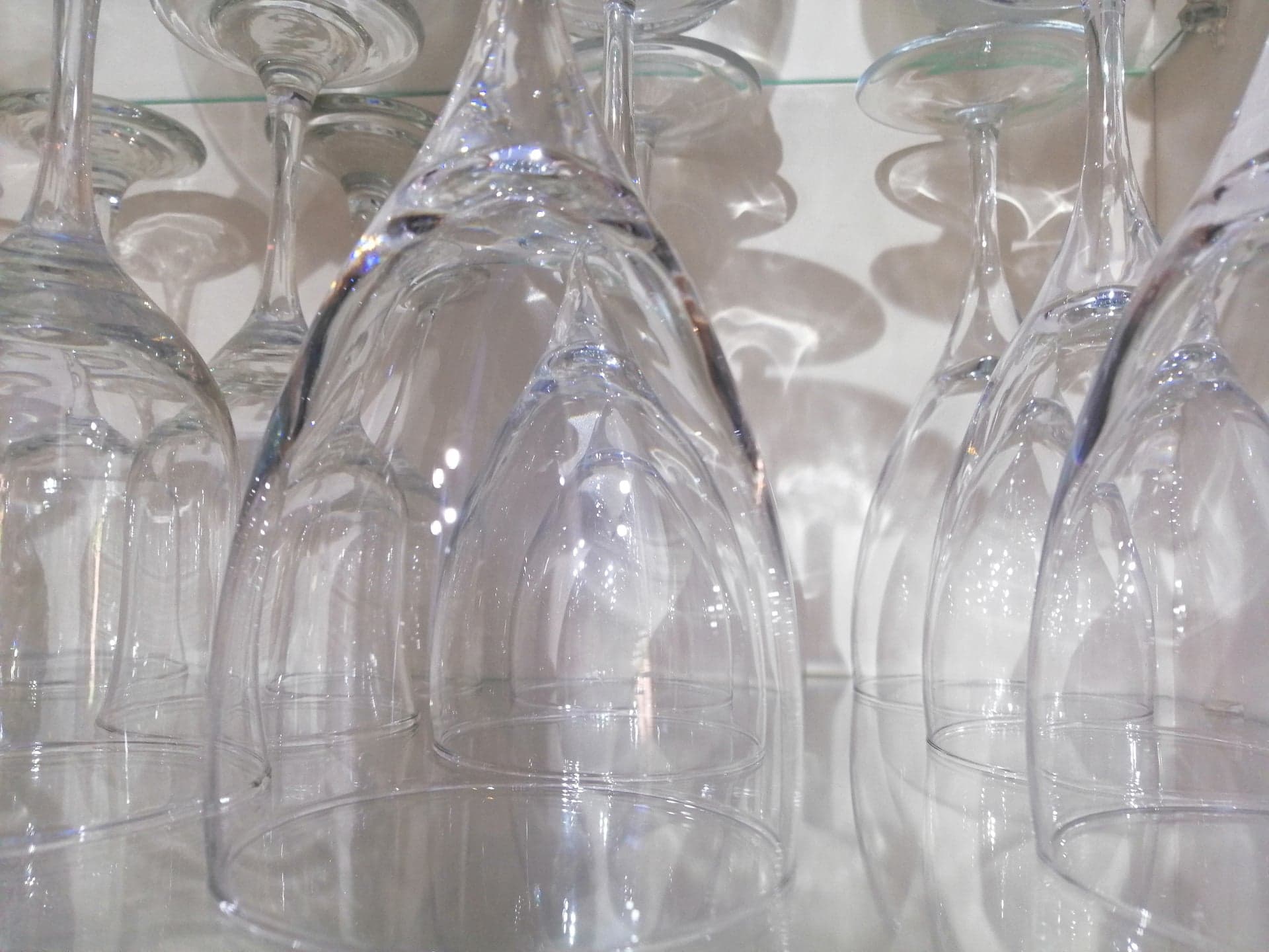
One of the key issues I came across was the wine glass. I initially took a photo and cut it out as best I could, but it looked messy and rough in the collage, so I decided to research how I could get a transparent effect. I took new photos of a wine glass, using a little lightbox – the advice was to light the glass from behind and diffusing the light from above so there wouldn’t be blocks of light on the glass. I also put black paper at the sides to help define the sides of the glass. I went into Affinity Photo to cut out the glass and play with the blend options (this was a good experimentation with opacity to achieve the glass effect). It was then a case of choosing an effect that worked well with the rest of the image. I really liked the vivid light option as it highlighted the bright white of the comet without loosing the effect of the glass.


This experimentation was all so valuable! I learnt a lot and did not feel restricted – the brief was quite empowering, as it encouraged me to make the images personal to me and form my own narrative. This was why it was so important to me to take my own photographs and draw some of my own illustrations, as well as creating the collages. It meant that the components were all linked to my environment and imagination. I pushed myself to try new techniques and better my digital skills, which I always find useful. I think I have achieved images that feel consistent in style.


One thing I noticed immediately when looking at all my images in the order of the poem was the gradual shift from bright, light, vibrant colours to a darker, more sinister palette. It was a happy accident, but I love this effect. It is quite telling in terms of the content of the poem – the whole narrative seems like a descent into this new, wild future. There is more mention of hell, music, dancing and the colour red too.
Comparing my collages to Malevich’s, mine leave more open space, whereas his are filled with shapes and textures and objects. I think I achieved his tendency to use blocks of colour to structure and balance the page, but perhaps not the same busy-ness of his work. Also, my blocks of colour are digitally created, whereas his look like painted shapes. My images have much more of a digital treatment – not necessarily a bad thing. It is as if his work and my work represent the same themes, but mine is the futuristic version, and his, the traditional version. Changes are bound to occur, but they are rooted in understanding from previous artists and designers. I definitely feel that I have created images rooted in Malevich’s style.
In terms of the overall theme of futuristic versus traditional, and urban versus rural, I think my work brings a range of imagery from both environments. The animals, grass, skies, and food items represent the rural and traditional theme, whereas the technology and space images link to the urban and futuristic theme. I also tried to include a range of typefaces, to represent traditional Russian history and new, futuristic, clean sans-serif movements.
I had a go at printing small versions of my images and blu-tacking them within my folded mock-up so I could keep moving them around and seeing what worked best. I started by seeing them in the order of the poem, then tried matching similar themes together or images that seemed to follow on from one another or portray a certain message. For instance, the record player and the squeal image seemed to work well together to me – it was a clash of technology and nature, but at the same time, there are some colour complements and a squeal noise seems an appropriate response for someone traditional to a new, noisy device.

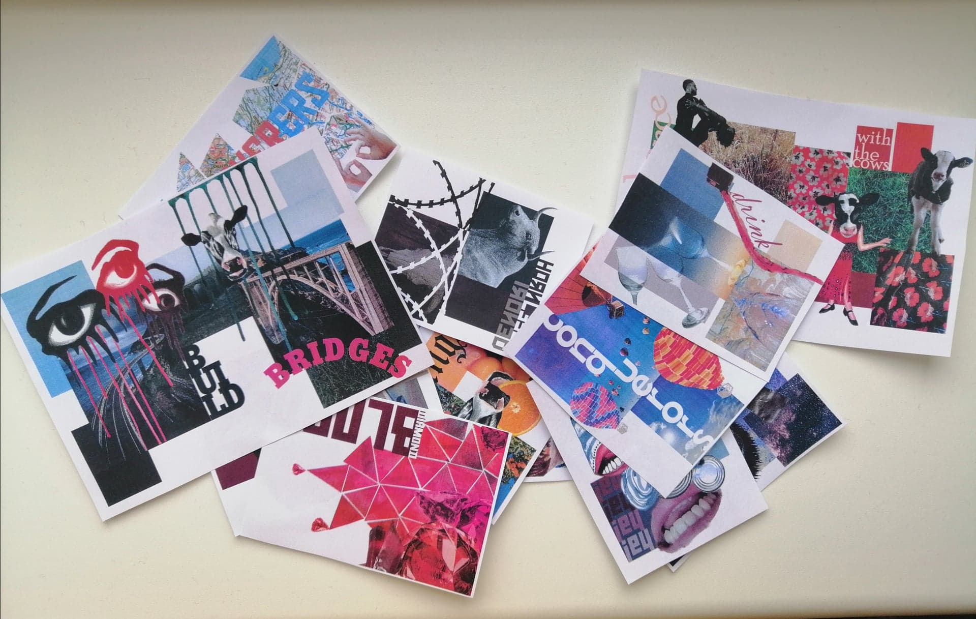


Once I found an order I liked, I glued the images into my mock-up to create a 2-sided folding document, as specified in the brief. This is only a rough document to give me some ideas and all part of the exploration process, but I liked the way the reader has to interact with the pages and the way the images work together.


I am now looking forward to reflecting on these images further and collating and binding them into a book. I hope to return to my ideas about matryoshka dolls – I would ideally like to create a book that encourages the reader to keep revealing images inside other images.
