For this first exercise, I couldn’t resist researching both Edward Bawden and E. H. Shepard. I compared these two illustrators with Jane Hissey, who wrote and illustrated some of my favourite childhood picture books (the ‘Old Bear’ collection). Below are images showing the research in my sketchbook, along with some comments analysing and comparing each artist. I then created my own illustrations in the style of each artist.
EDWARD BAWDEN


E. H. SHEPARD


JANE HISSEY


CONTEXT
Both historical illustrators lived and worked through wartime. Bawden was an official WWII artist, while some of Shepard’s work for ‘Punch’ was influenced by WWI (such as ‘The Uses of a Zeppelin’ – see sketchbook research page). Each brought a sense of comedy and fun to their art; an effort to cheer the country during difficult times. Shepard’s cartoons, in particular, are an obvious attempt to poke fun and make light of dark situations.
STYLE
Bawden’s work – focusing on his prints – is bold, using block colours and black lines and patterns. The shapes are generally jagged, geometric (especially in his images of buildings and landscapes) while the colours are kept to a minimum. Usually, a few subtle colours are used, with one or two bright, striking colours to pick out certain shapes and features.
Hissey’s illustrations are very colourful and her style is soft and realistic. The textures she creates using pencil colours are incredibly detailed and true to life. Although Bawden’s work depicts buildings or animals that are still recognisable, the level of detail in Hissey’s work is far greater.
Shepard’s illustrations use subtle colours, with expressive black ink lines to add detail over the top. This use of black to pick out lines and shapes is similar to Bawden’s, but the lines are scratchier and create a sense of movement on the page. Also, the shapes are less harsh, more fluid, round and soft, whereas Bawden’s seem more distorted.
PRODUCTION
Bawden used printing techniques, such as lithography, and created stencils. Some of his work was also created using watercolours, like Shepard. Shepard added lines using ink over subtle colours. In contrast, Hissey outlines the structure of her images with pencil, then builds up layers of colour using pencil colours.
OLD-FASHIONED…
I didn’t find Bawden or Shepard’s work old-fashioned. I think the content of some of the illustrations revealed their historical context, such as the war cartoons in ‘Punch’. However, Bawden’s prints are exciting, slightly distorted, striking and colourful – I found some of his work for ‘Twinings’ and ‘Fortnum and Mason’ and mused that it wouldn’t look out of place today. It has a flavour of the past and yet still feels current. Shepard’s illustrations, particularly for A. A. Milne’s ‘Winnie the Pooh’ stories, are so familiar and remind me of childhood. They have a nostalgic quality; people across generations recognise and know the characters (we still see them today!) These, perhaps, seem more old-fashioned than Bawden’s.
WHY I WAS DRAWN TO HISSEY…
Ever since first encountering Hissey’s picture books as a child, I have aspired to the level of realism she achieves in her drawings. She manages to portray characters and stories that are warm and comforting; just one illustration can consume you due to the level of detail. I also love that her characters and stories are personal, inspired by soft toys that she owns; this undoubtedly adds to the feeling of the books.
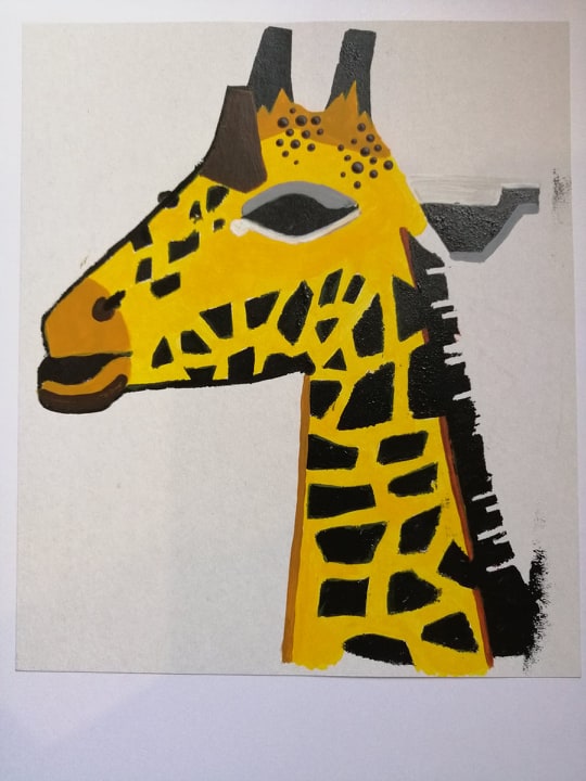
REFLECTIONS BAWDEN-STYLE STENCIL GIRAFFE

I decided to focus on the lion image by Bawden – this is probably my favourite – and took this as inspiration to create my own illustration of a wild animal. Looking through photographs I took during a trip to Dublin zoo, I was drawn to the giraffe due to the patterns and colours. I played around with designs and was careful to ensure the stencil would stay together. With the materials I had available (cardboard and a craft knife!), I created the stencil. Initially, I tried using a large paint brush to apply the acrylics (bright, bold colours) but this wasn’t achieving the effect I had in mind, so I used a sponge instead. This didn’t give a clean finish but I quite liked the texture it created.

On the black stencil image, I went back and defined the shapes and patterns with a small paintbrush. I filled in shapes with more colour, prompted by the lion image. The colourful stencil image I left alone because I quite liked the faded, subtle effect of the sponge and the slightly dull colours (although this isn’t very Bawden-esque!) I think the illustration could be cleaner, but the overall combination of shape, colour and pattern works well. As a first attempt at a stencil, I was fairly pleased.
REFLECTIONS SHEPARD-STYLE FOREST SCENE

For this illustration, I wanted to challenge myself in terms of content. I very rarely venture into landscapes of any kind, be it a natural scene or a cityscape. I usually find these boring to create, however I truly adore admiring them and any art created based on them. I took a walk through my local park to do some sketching and take some photos to help me with this illustration. As many of Shepard’s story illustrations are set amongst the trees, I decided to use one of the views to inspire my own. I began by using watercolours to pick out the shapes (as I was doing this, I realised I was applying far too much paint; Shepard’s colours are pale and watery) then I added details the next day using an ink pen. Again, I felt I was being heavy-handed with the ink and adding too many lines. However, looking back at the finished piece, I am quite pleased with the overall impact. I tried to take prompts from the patterns and lines used by Shepard in his ‘Winnie the Pooh’ illustrations. The trees may be too dark with too many patterns added. I will definitely try working this way again and will not avoid landscapes quite as much in the future.
REFLECTIONS HISSEY-STYLE OLD BEAR

For the Hissey-style illustration, I was desperate to achieve the same feel of warmth and comfort, using soft colours and creating realistic textures. I propped our own Old Bear up against a chair and drew him from there (I experimented with a few poses first. Hissey pins hers in position, but I couldn’t bring myself to do that! A natural sitting position seemed to work best). I am really happy with the textures I created with the pencil colours and the yellows work well. I feel that I could have built up more layers to achieve more realism, but the old worn quality of the fabric is visible.

References


