Making mistakes
Before starting to consider my final four books and the materials I would need, I practised each design with plain white A4 paper. My immediate impressions were that I liked the designs that folded up and went in different directions, rather than the design with pockets all the way through.

To begin, I collected the materials I would need; a chose plain white A4 paper, thicker cartridge paper, graph paper and rainbow card. My mark-making tools were a black biro, a green crayon, acrylic paints with a cotton bud, and a paintbrush with watercolours.


I really enjoyed this exercise; ironically, it was freeing to have a time limit. I did not feel as precious about my drawings and so simply let myself capture what I could. My mark-making became more expressive and loose with each drawing, and especially with the paints (these were my most successful books, I feel).

Below are images of my books and comments when I went back over each page and worked into the drawing with other materials. I also listed what the drawings reminded me of and any ideas that were sparked during the process.
Book 1
Design 1 – graph paper – black biro – “in front” – 5 minutes


Book before modifications
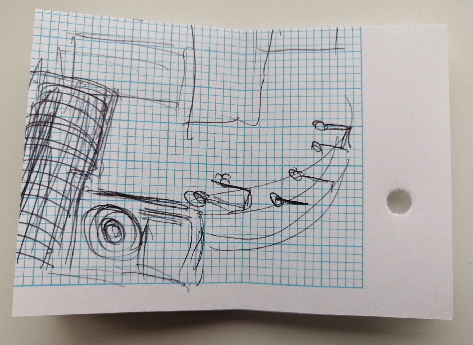


Book after modifications


I felt as if this book looked like a school exercise book, especially as I had chosen biro as my mark-making tool. I worked into each page with other biros (blue/green/red) and highlighters, to stick to this ‘school’ theme. The highlighters both added colour (a big area could be covered quickly) and were effective to outline shapes that stood out to me and push them into the foreground. My biro mark-making added a little more depth and pattern. This book seemed the most “blank” to begin with and so the alterations made a huge difference.
Ideas/themes:
- roads and road signs and lights
- maps/buildings seen from above/floor plans (probably due to squared/structured paper)
- school workbooks and doodles
Book 2
Design 4 – rainbow card – green crayon – “left” – 5 minutes


Book before modifications


Book after modifications


I felt the green crayon was sometimes lost a little on the rainbow card, so I decided to use red crayon as a contrast and picked out certain shapes to dominate (as red is such a striking colour). I also chose to outline some of the spaces created between the crayon lines (negative space) with blue biro. The colours worked well together and the biro massively altered the effect of each page. By focusing the attention on the spaces between the lines, the images became much more interesting.
Ideas/themes:
- greenhouse
- glass
- garden
- structure and chaos together
- sound travelling/wind moving or carrying something
Book 3
Design 3 – white paper – acrylics/cotton buds – “behind” – 5 minutes


Book before modifications


Book after modifications


This book was my favourite before working into each page! I absolutely loved how the whole image split up into parts that each contained interesting shapes, textured marks and bold colours. I decided to use pencil colours to work into the pages; the paint marks that I had made with the acrylics and cotton buds were so textured and exciting and full of energy and movement, I did not want to disturb this too much. I felt that pencil crayons would allow me to add subtle hints of colour in the “space” without overpowering the existing marks. In fact, I found myself “enhancing” the shapes by shading around them, adding depth, and repeating them (in a lighter tone or different colour), like echoes or shadows. Also, as I was shading, some of the textured paint shapes showed through, like rubbings, adding to this “echo” effect.
Ideas/themes:
- flowers
- summer
- clothes shopping/colour-coded clothes hanging up/folded/piled up
- libraries/books – ideas and stories jumping out of the books
Book 4
Design 2 – cartridge paper – watercolours/brush – “right” – 5 minutes


Book (no modifications)


I didn’t make any changes to this book. As I flicked through, each page had a good coverage of colour, some striking marks and interesting shapes against more subtle blocks and flowing textures. It seemed to tell a story – with a consistent style but such a mixture of shapes and colours – and I really liked the clash of brown, blue and pink. The images are strangely calming even though they look a little rushed (maybe this is the overwhelming effect of watercolours).
Ideas/themes:
- seaside/sand/waves/dunes
- old seaside hotel, decaying wallpaper and ugly curtains
- fishing, boats and docks
- the style of some of the thin, jagged marks reminded me a little of the opening credits of Disney’s Mulan, with the ink paintings of mountains
Final reflections
I jotted down all these thoughts and reflections in my hand-made sketchbook and included photographs and photocopies of each sketchbook (in anticipation of further alterations in later exercises). My favourite book was definitely Book 3, and I think the design/format of this was also my favourite (the design that spiralled inwards). It created pages that were twisting in different directions and the marks I had made worked well with this format. My least favourite was the design with a pocket all the way through; it was a more “straightforward” concertinaed book, but I felt the whole image wasn’t on display (because half was on the “back”) and the type of paper I chose didn’t help with this (stark white against rainbow).
