Experimental typography
This brief asked me to read through the extract from Jules Verne’s ‘20,000 Leagues Under the Sea’ and experiment with the type. I needed to consider Derek Birdsall’s advice on choosing a type (from the previous research task), take inspiration from designers I have already researched (and some that were mentioned in the brief), and think about the descriptive words, the sounds, and portraying this in my type decisions. There was also instruction to mix analogue and digital approaches in this experimentation, and to PLAY. I was excited to get started!
First, I read through the extract and highlighted any words that jumped out to me. I made notes around the extract about the story – key characters, themes, and events – that might inspire ideas later. I also split the brief up into sections so I could ensure I had covered everything.


I wanted to create a moodboard for this task, as it was mentioned as a method I did not use in the last part by my tutor and I thought it would help to provide visual inspiration for my type decisions. I searched for images based on my notes and research so far and used colourful pens to capture the shapes of waves, tentacles and other sea-themed images.

This had already sparked lots of ideas, but I was eager to explore lots of possibilities and collect as much source material as possible. I went back to my research of book designers from Part 2 and picked out some covers that stood out to me and looked like they could be useful for this task. I also searched for the designers and artists mentioned in the brief, choosing to focus on David Carson, Marinetti, and Schwitters.

As I collected this research and these images, I realised my ideas focused on flow, waves, fluidity, and an almost sculptural form. I had other ideas around overlapping or layering type, which could also tie in with this fluidity – like water, the type would look like it was moving, flowing, merging.
Next, I delved into a book my tutor recommended that I have been pouring over through Christmas – ‘Hand Job’ by Michael Perry, a collection of handwritten type. As the brief stated, I was keen to use a mixture of digital and analogue methods, so I thought it might be nice to draw some inspiration from handwritten type for further experiments. I picked some type that stood out to me and chose words from the extract to play with.

I really enjoyed this experimentation – the descriptive qualities of the hand drawn type work well with some of the words in the text. I particularly like the two types I used for ‘thing’ – they add that sense of mystery, perhaps a monster, a creature that is unknown, large, but easily melts away.
Next, I wanted to use my research ‘on choosing a typeface’ by Derek Birdsall to select a single typeface for this extract. I thought about the numbers in the titles and how this might influence my choice, the readability and legibility of the type, and how the type looked in italics, as a heading, as a subheading, and as the main body of text. The relationship between all these elements needed to be harmonious. I started with some modern and old style types. I briefly explored some futuristic, sans-serif types for the main body (influenced by the sci-fi theme of the novel) but these did not work as well. I also tried some type-writer typefaces, influenced by the mention of old naval log-books, but I also felt this would not work as a readable type.

I settled on Bell. It was a suggestion from Derek Birdsall and, after comparing it to lots of others, it really did look best in all forms – as a heading, in italics, the numerals were smaller than the capital height – it ticked all the boxes. I adjusted the leading and chose sizes for each section. This was the final ‘normal’ layout with a single typeface.

It was time to experiment! I drew some thumbnails of my ideas in my sketchbook, linking them back to all my research and visual inspiration. I was eager to develop my digital skills while also incorporating my hand drawn ideas too. The thumbnail images were technically the first stage of experimentation – analogue – and I then moved on to create some of these using DTP software.

My first quick experiment was with the warp tool – I tried to give the impression of a fluid, moving page. This was inspired by Julia Hasting and her cover design with the wobbly, watery text. It was fun to immediately change the way the text is read and how the page appears. I think it might look more “1960s trippy” than “ocean wave”, but it was a valuable experiment. I wondered if this warping could be used along with another design to add more intrigue.

Waves
I started with the idea of waves, moving up and down across the page. This started as a very basic layout, but I kept adapting this. I used the pen tool to draw the lines that the text would follow (I had to ensure the lines were invisible before adding the type). The initial design looked like this:
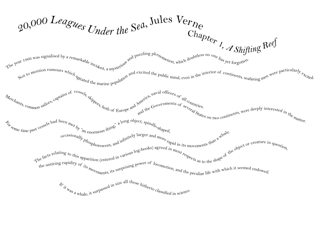
I liked the movement this created, but I wanted to try changing the rhythm of the text by altering the size of some of the words, and the weight. I chose specific words, like ‘larger’, and changed individual letters to help describe the word. Marinetti, Schwitters, and Carson all use varying sizes of text in their designs, so the inspiration came from them.

This looked far more interesting and reminded me of shape poetry or a children’s underwater picture book. As another experiment, I tried keeping all the words on a line a consistent size, but changing each line’s size. I also layered the chapter title and the title of the novel, adding a little colour. This was inspired by Schwitters use of one other colour of text and the way he layers this with the black and white. I do not think my design is as radical or artistic – it is still easily readable in comparison – but I quite liked that touch of colour. It also helps give the idea of ocean or water.

Next, I wanted to try the warp tool again, with this design, because the different sized lines were – to me – not as interesting as changing individual words and letters. I changed each line, one at a time, to give the impression of rolling waves, growing and shrinking.

My final experiment with this wavy structure was to print out the waves and slightly rearrange them, take out certain words, and hand draw my own. This added a more descriptive element and reminded me a little of Ruth Martin’s designs, where she replaces letters, groups of letters and sometimes words with little icons. Although these are still full words, they have a more illustrative feel than simply typing them on the computer. It also reminded me, again, of a children’s picture book.

Rolling wave
I wanted to try a more sculptural type experiment, creating a wave that looked more realistic than wiggly lines. I used my moodboard for reference and drew my thumbnail design of a wave that is growing. For this digital creation, I used the pen tool once again to indicate where the text should travel. I was also much less precious about the text being readable or in a specific order – I simply used the extract to build the image. As I had preferred the effect of manipulating individual letters and words, I kept this going.

This was a design I was really happy with, but I thought I could try taking it further by using colour. I tried to create a movement from deep, dark, to light and shallow.

These two are some of my favourite designs I created. It felt like an achievement to create these digitally, and I think they capture the theme of the extract well, while still being quite readable (although the order is complete nonsense!)
Whirlpool
One of the key themes I had picked out from my research was a whirlpool – Maelstrom – which I immediately thought would be exciting to use with type. I created two – one black and white with different word and letter sizes, and one in colour, with the words getting smaller as you move to the centre of the whirlpool.


Tentacles
I liked the idea of creating tentacles, purely from the text, and I felt it would be a good opportunity to ignore readability and create something sculptural. The larger letters in Marinetti or Carson’s work look like images by themselves, and I wanted to try something like this. This is probably the design I am most proud of – a few months ago, I would never have attempted this, so to have created this purely digitally feels like an achievement. I used the pen tool to draw the tentacles and guide the text. I think it looks intriguing, and more like a work of art than text to be read, although some is still quite readable, and I think the title of the novel is still quite easy to pick out.

Crashing wave
Next, I printed out the extract in my chosen Bell type and tried cutting and pasting the words to create a crashing wave. This was much more time-consuming than my digital experiments, but I was keen to see if the effect was more pleasing.

I was pleased with the shape here but because I had used the same sized text for all the body, there was not much tone. To build this up, I tried using a set of alphabet stamps and ink to print select words over the top of this design (I photocopied it first!) I chose specific words and kept my printing close together towards the deeper, darker areas and spread out the letters towards the top, where there would be white foam and lighter colours.

I was delighted with this – it has a very different effect to the purely digital designs and also happily reminded me of the old log-book type. This much more layered effect looks similar to Schwitters work and the printing marks from the stamps remind me of Carson’s work.
Hand drawn and digital
Finally, I wanted to use some of my hand drawn words to create designs for specific extracts. I also used a little drawing here to add to the text/image. I was hoping to give the effect of creating a shape with the text, like Phil Baines with his Marco Polo cover.

With this design, I wanted to break away from my chosen type and mix up the choices for the word ‘enormous’ – I deliberately selected types that were chunky and bold and large. I played around with the sizes and added my hand drawn ‘thing’. I think the use of italics Bell helps balance the piece – it looks like it could be inside a picture book.

This was using the word ‘marine’ and also my drawings of scales for the fin. I changed the sizes of letters in ‘agitated’ to give the feeling of being up and down and in some form of discomfort or excitement.

This was a small extract of text, using my hand drawn word ‘larger’, that I thought could work well as water coming from a whale’s blowhole. I drew the whale in black ink on the printed copy of the type.


A final little experiment was this version of the title of the chapter, using Wolfgang Weingart’s cover for inspiration. I cut off half the text with a wavy chop, so it might appear as if the letters were in water or bobbing up and down on the waves.
I have thoroughly enjoyed this task and I am hoping it shows in the experiments I have produced. It was fun to pick apart the text, alter the rhythm and readability, and create layouts that were more sculptural than readable. One of my aims was to continue to develop my digital skills, which I feel I have done, and to combine approaches – I think this will continue. I am hoping that these experiments will prove useful when coming up with ideas for the assignment. It was also very useful to create a mood board for this task as I feel that a lot of my ideas were influenced by this imagery.
